
Table of contents
At NoA Ignite, we are lucky to have lots of clients that are fun to work with and support a good cause. AbleFinder is one of them. Since last December, we have given this Australian social start-up with an exceptional mission some pro bono support.
Creating a community for parents of a child with a disability
AbleFinder’s mission is to battle social isolation amongst parents of special needs children. Caring for a special needs child is demanding and time-consuming. That’s why many parents have a limited social life. AbleFinder wants to connect these parents through an app and let them share their experiences and learn from each other.
To reach this goal, they created an application based on the ‘match and chat’ principle of certain dating apps. You create a profile and can view profiles of other parents. You can adjust your settings to see people who are located nearby, or who have a child with a similar diagnosis or of a similar age group. Swiping a profile up means ‘waving’ at this person. When the other parent ‘waves’ back, it’s a match and you can start chatting. Swiping down means that you skip this profile for a bit and you can connect another time.
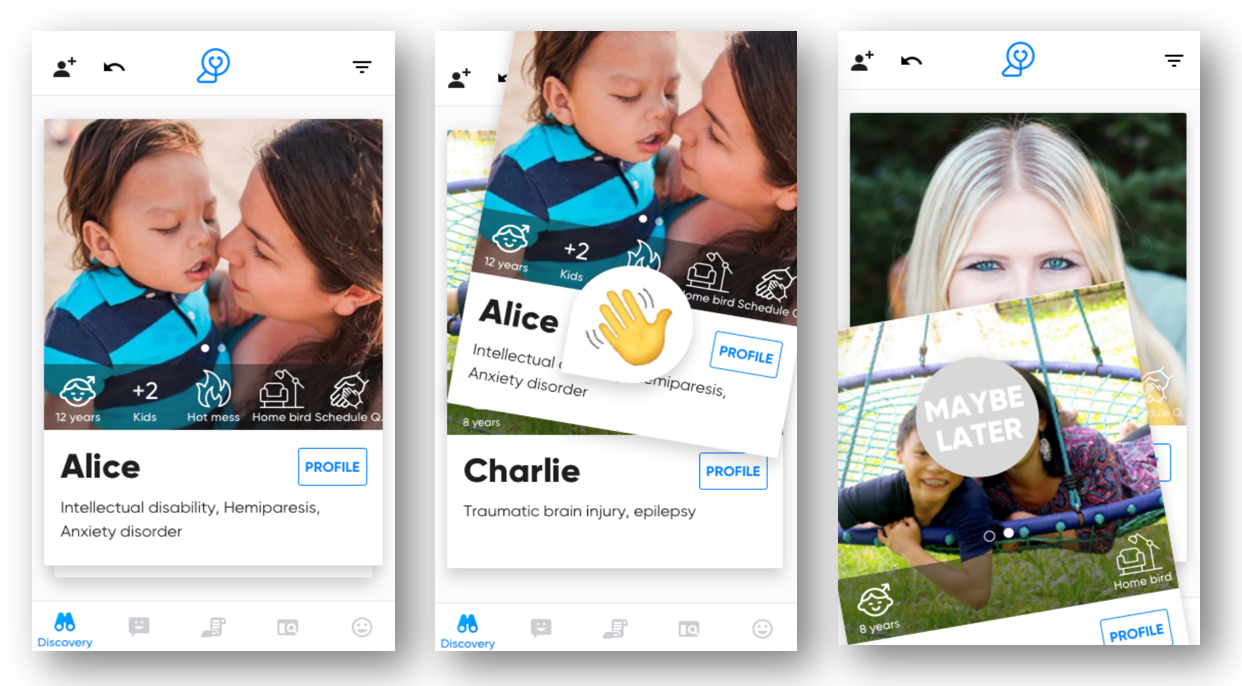
The app also includes a Library where parents can read inspiring blog posts from other parents about the different aspects of parenting for a special needs child. And finally there are Groups where users can share experiences online based on criteria such as geographical location or similar interests.
With this platform, the AbleFinder team wants to create better connections between the different disability communities. Overall, the existing communities are mainly based on diagnosis, but what is relevant for a parent of a child with autism, might also be helpful or inspiring for a parent of a child with Down syndrome. By redefining groups and offering a Library, AbleFinder wants to bring communities together.
Empowering the community through an empathetic product voice and tone
Our contribution to the app was mainly in the field of UX writing. “UX what?” you say. Well, UX writing is a brand new discipline that specialises in writing the words and phrases of digital products. It can enhance the brand, boost user engagement and conversions, and remove potential friction between the user and the interface. You can read more about UX writing in my previous blog post “UX writing – Design the conversation between the user and your interface”.
When I joined the project, many of the designs for the match and chat experience had already been developed. In an ideal world, the UX writer will be involved in a project from the start to give input from a writing perspective. This approach can avoid design issues in a later stage of the process. Luckily, there weren’t any big issues, even if my input influenced the design here and there and even changed the flow slightly. So if you can involve a writer early on in the design process, this will almost certainly save time and money.
The words throughout an interface should ideally always be written according to the holy trinity of UX writing: clear, concise and useful. Sometimes these three aspects compete with each other, so the art lies in finding the right balance. On top of this solid basis, a brand can add its own voice and tone. This is generally based on the company’s brand messaging, business goals, or the general context of the user and their needs.
The target audience of AbleFinder is very specific and has particular goals and needs. The app should be a place where people who are very busy caring for their child can find some joy, understanding and support. That is why the overall voice of the product should come across as both empowering and empathetic. But parents use the app to make friends, after all, so it should be a fun experience. That’s why the voice should also be friendly and even bubbly.
No confusion, but clarity
The number one focus of any interface is to be crystal clear for the user and to avoid confusion or frustration. I made sure that every bit of text in the app is understandable, while taking into account the different stages of the user journey throughout the app. A nice example of a necessary update was the pop-up screen below.
This pop-up below appears when the user has skipped a profile, and then taps the button to bring it back. The first version (left-hand side) was rather confusing as it was not clear what the users would undo when tapping “confirm”, or what they would confirm by tapping “undo”.
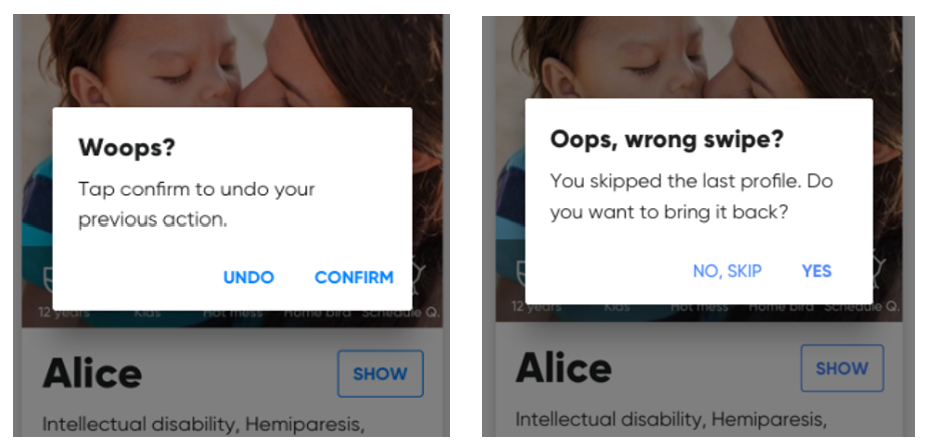
In the update on the right-hand side, I specified the action the user wants to eliminate (a ‘wrong swipe’) while asking a clear yes-no question about the next step they want to take. I also tried to write it in a way that the result of tapping a call-to-action button (CTA) is the same, no matter which question the user is answering: “Wrong swipe?” or “Do you want to bring it back?”.
Reconsider standard terminology
On top of being clear, the copy also had to be highly empathetic and take the context of parents with a special needs child into consideration. You need to think of how a parent’s reality can be reflected in the app. A good example where UX writing made a difference is the section in the user profile where parents add their kids to the app.
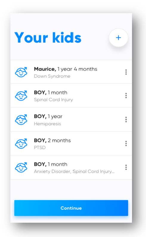
This is where users add children to the list, take them off the list and edit the details of their profiles. On the left side below, you can see the original dropdown menu.
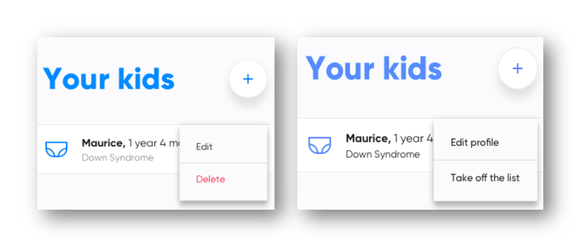
“Delete” is a common word in digital interfaces. In most cases, it is clear and functional. In this case however, deleting a kid from the list probably reflects a reality where something deeply sad and terrible has happened. No parent wants to ‘delete’ their kid anywhere, neither virtually nor in real life. So the app shouldn’t force them to do this neither.
That’s why this tiny piece of copy needed an update not to evoke such strong negative associations. I added the more neutral expression “Take off the list”, which implies less refusal or disapproval than “Delete”. This alternative might be a little longer and more wordy, but taking away as many negative emotions as possible is what matters most in this particular situation. The original red colour even increased these negative emotions, so I suggested to keep all the text black.
It’s not just a user’s actions, but about emotions too
Another good moment to really empathise with your user is when they start discovering different profiles. Because most parents have a good idea of the daily struggles of the profiles they see in the app, skipping a profile might make the user feel guilty.
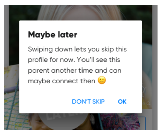
To address this potential guilt, the app includes a small pop-up when the user skips a profile for the first time. It’s more than just an instruction. It’s a short message reassuring the user that they’re doing nothing wrong and that they’re not harshly rejecting another parent. By adding this friendly pop-up, the app tries to nip in the bud any negative feeling the user might experience.
So as you can see in these examples, UX writing can have a positive impact on the user experience. Ultimately, this will also influence how they feel about the entire brand.
We are very happy that we can help the AbleFinder team with our expertise. Because special needs parents deserve a great platform to find the support they need.
If you want to know how we support digital health check it here: noaignite.co.uk/digital-health
For more information about AbleFinder, check out their home page ablefinder.com.

Book expert consultation!
If you want to talk to our experts about this article or related question – just reach out!
Author

Pieterjan Benoit
Content Editor
Pieterjan is a Content Editor from Belgium with a background in communications and media. His passion for words and languages take him on journeys of copywriting, translating and recently also UX writing.
A certified beer sommelier, he loves to try new beers and blogs about bar and brewery visits while travelling.
Related articles
![A well-crafted prompt doesn’t just work once. It works across teams, channels, and campaigns. It can be tweaked for new use cases and refined based on what performs best.]()
June 27, 2025 / 4 min read
Prompts are not just for AI. Why building a prompt library pays off
Prompts aren’t throwaway lines. They’re repeatable, scalable assets that can streamline your marketing your team’s output. Learn how to build a prompt library that delivers.
![Woman using a wheelchair in the office settings]()
June 17, 2025 / 5 min read
What is accessibility and why it matters?
Accessibility ensures everyone — including those with disabilities or limitations — can read, navigate, and engage with your content equally.

