We all know how quickly the world of web and mobile changes. Brands are constantly looking for innovative ways to stand out and trigger the attention of the users with intuitive interfaces or slick designs. Still, it seems to me that one key aspect is often forgotten, but might have the biggest influence on a user’s experience. I’m talking about the content, the text that guides the user through the story within the interface. The discipline of designing these texts is called UX writing.
I’m sure I am not the only one who feels frustrated and alienated when coming across coding language such as ‘error: invalid code’. Changing that to ‘Oops, something went wrong’ doesn’t always solve the problem of how you want your brand to communicate with the target audience. And especially these pieces of text can make or break how the user feels about your website or mobile app.
In this article, I’ll give a few reasons why UX writing an essential part of the process of creating a website or mobile app.
The personality behind the interface
The past few years the interaction between users and website and app interfaces has become increasingly conversational and human. This trend is almost certain to gain more ground, thanks to the approach of pioneering companies such as Google, Uber, Netflix, Mailchimp and many others. For them the user experience is top priority. Every button, notification or confirmation message of their interface evokes an image in the user’s mind that embodies the voice and personality of the brand. And with this image the user builds a connection. Or not.
To let the user connect with your brand, the key word for the brand voice is consistency. It is important that your brand speaks with the users in the same voice during every interaction in order to maintain the connection with them and to keep them happy. Clear guidelines about voice and tone or a content style guide are a good foundation to fall back on in case of doubt about writing for your interface.
Boost your business
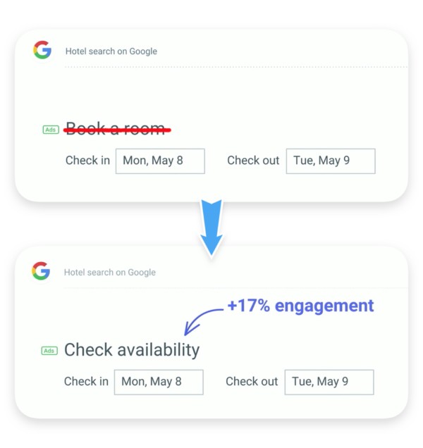
Connecting with your audience is a valuable asset, but might sound a little dreamy to convince some people. Luckily there are several examples that illustrate the measurable return on investing in UX writing. I call upon an (already famous) example of Google Hotel Search. This search option used to have the headline ‘Book a room’. By doing some A/B testing, Google found out that they could boost the click-through rate by 17%, just by changing this short sentence into ‘Check availability’.

If you think about it, this makes perfect sense. At this point in the user journey, a lot of users aren’t considering to book a room just yet, but only want to have a general idea of their options. By changing this tiny bit of text, Google removed a mental barrier and addressed the user’s mindset at that very moment. The result was a significant boost in conversions.
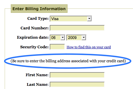
Investing in UX writing also has indirect positive consequences for your business. Some people say that the UX writing and microcopy wave started with a blogpost by Joshua Porter. He was working for an e-commerce website and received a lot of notifications from people who had issues during the payment process. So he decided to add a short sentence to the page: ‘Be sure to enter the billing address associated with your credit card’. By adding this sentence, the cries for help disappeared. As a result, Joshua could invest his time in more useful and profitable ways than helping frustrated customers.

To cut a long story short: Good UX writing can help to reduce the friction between the user and the interface by creating a smooth and easy user journey. This also reduces the time and money invested in customer support. More conversions, happier users and less hassle: What’s not to like?
Adjust the playing field to the sport
Has it ever happened that the final designs of a new website or app are sent to a copywriter to replace every instance of ‘Lorem ipsum’ text with actual web copy? This might sound familiar, doesn’t it. Well, I can say from experience that by doing this you can put your copywriting colleague in a tough spot. In his blog post about writing being a designer’s ‘unicorn skill’, Leow Hou Teng puts it very clearly:
“Using placeholder texts means the designer only considers the design of the container that holds the content rather than the design of the content itself. Without the context of data and content that is relevant to the user/viewer, the design may not turn out as intended.”
Leow Hou Teng, ‘Writing is a Designer’s “Unicorn Skill”
To use a metaphor from sports, avoid designing a beautiful field-hockey pitch for what in the end should have been an ice-hockey skating ring. Get it right from the start and design your playing field according to the sport you want to play. The same goes for the UX design – create them according to the content that is necessary to convey the clearest message and improve user experience.
User journey as the foundation
Every UX or UI project should start with a deep understanding of how the user will navigate in the interface. The creation of this journey in the interface combines both writing and design and should be created simultaneously. By including UX writing early on, you avoid potential bottlenecks in later stages of the project.
This also means that during user testing, early versions of the copy (protocopy) should be included in the designs. This way you can assess the entire experience for the user and make changes early on in the designing process. Wireframes and protocopy should always go hand in hand.
Do you want to know more about how UX writing can improve your interface? Send an email to post.uk@noaignite.com and we’ll get in touch with you.
Author

Pieterjan Benoit
Content Editor
Pieterjan is a Content Editor from Belgium with a background in communications and media. His passion for words and languages take him on journeys of copywriting, translating and recently also UX writing.
A certified beer sommelier, he loves to try new beers and blogs about bar and brewery visits while travelling.
Related articles
![A well-crafted prompt doesn’t just work once. It works across teams, channels, and campaigns. It can be tweaked for new use cases and refined based on what performs best.]()
June 27, 2025 / 4 min read
Prompts are marketing assets: how to reuse, and scale them
Prompts aren’t throwaway lines. They’re repeatable, scalable assets that can streamline your marketing your team’s output. Learn how to build a prompt library that delivers.
![Woman using a wheelchair in the office settings]()
June 17, 2025 / 5 min read
What is accessibility and why it matters?
Accessibility ensures everyone — including those with disabilities or limitations — can read, navigate, and engage with your content equally.


