Matopedia: Redesigning the digital learning experience
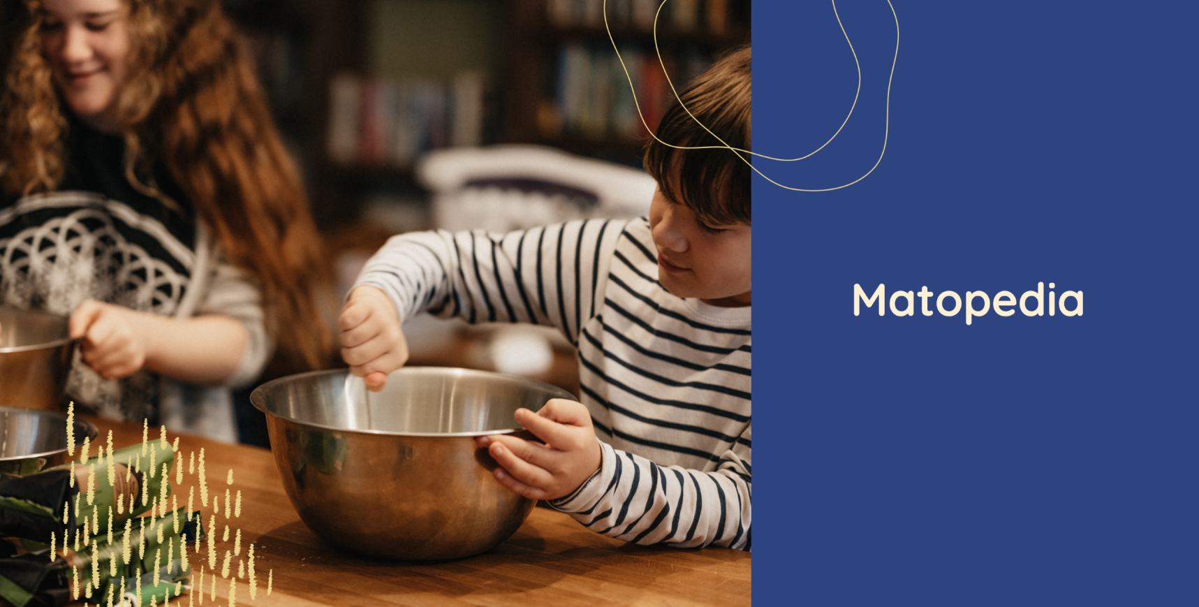
NoA Ignite has been working with MatPrat, the largest recipe portal in Norway, since 2014. Together we redesigned Matopedia, a digital curriculum for teachers and pupils that fosters a sense of enjoyment and appreciation for food.
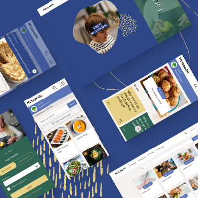
About the project
MatPrat creates teaching aid for Food & Health classes in Norwegian schools. A recent chapter of our cooperation focused on building Matopedia, a digital platform for food and health subjects. The goal of the project was to prepare an environmentally friendly resource, that will replace printed textbooks. We wanted to provide teachers and students with theoretical and practical food knowledge.
Matopedia, launched in 2017 with the collaboration of NoA Ignite Norway, garnered widespread usage in schools. It prompted the client to prioritise UX and UI improvements in 2019.
This was a gigantic project for us, as the redesign of the platform happened simultaneously with a complete revision of the curriculum and a change from one to two languages, involving a huge production team and a lot of external professionals and partners. Turning this massive scope into a user-friendly solution was a challenge, but with a seamless collaboration with our NoA Ignite-team, we landed on a result we are all proud of, and that teachers and students enjoy using.
Hanne Svärd
Head of Digital
MatPrat
Key numbers
29,6%
Registered Elementary schools for 2022/23 classes in Norway
57,6%
Registered Lower secondary schools for 2022/23 classes in Norway
The challenge
In 2019 MatPrat recognised the need to improve the user experience of the portal. MatPrat first collected valuable feedback from teachers and understood the requirements and needs of end users. Then, we rebranded the portal to revamp its visual design.
One of the major challenges faced was adapting the portal visually to its two primary audiences – teachers and children. It was essential to create a branding identity that would resonate and foster a stronger connection with the platform.
In addition, specific components of the platform, such as the lesson page, campaign page and front page, needed to be fully editable for the editor in Optimizely CMS. It was important to ensure all components of the editable pages would seamlessly fit together. It was also key to implementing an easy language switch feature between Bokmål and Nynorsk.
Another challenge was related to the broadness of the design scope, which included creating a new key visual for the website. A simplified logo was developed to refresh the brand. The website was completely redesigned to improve user experience. All these changes were implemented based on feedback collected from various user groups, including teachers, students, and website editors.
Team
- Back-end developer: Łukasz
- Front-end developers: Natalia, Dawid
- Project manager: Andrzej
- Designers: Magdalena, Mariola
- Client Director: Dariusz
Deliveries
- Logo and branding
- UX & UI Design
- Development and integrations
- Maintenance and support
- Technical consultancy
Our approach
Delivery based on feedback and collaboration
To ensure the successful and predictable delivery of the project we emphasized aspects such as:
- Gathering requirements
We began with interviewing current and potential users and customers of the portal. This helped us to gather insights and understand their true needs. - Collaboration and feedback
We worked closely with the MatPrat-team throughout the project. We communicated daily via Teams, Slack and email. - Designing with Figma
We created design mock-ups and interactive prototypes using Figma. It allowed the stakeholders to provide feedback and come up with suggestions. We also used Figma to hand off work to developers for seamless implementation of approved design, but also for live collaboration on design during the implementation process.
New, vibrant branding
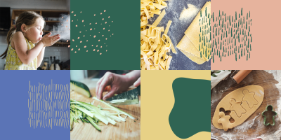
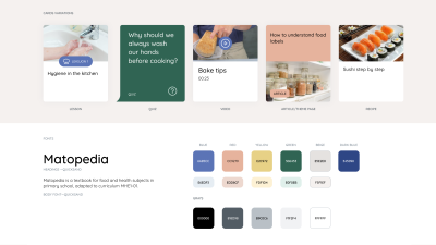
We aimed to create a branding that would foster a playful atmosphere. We added new colours to help distinguish user roles and levels within the platform. More colours were introduced to add liveliness and engage kids using the platform.
The overall style of branding is friendly and colourful. It reflects a warm environment for the users. The patterns we chose represent shapes and objects usually found in the kitchen during the cooking process. For instance, blobs symbolize dough, and lines represent pasta. The goal was to visually connect the design to the culinary world.
Additionally, we created a new, simple logotype. It distinguishes Matopedia from MatPrat and MatStart products and boosts the overall friendly feeling of the platform.
More engaging lessons
Repetitive components – more freedom for editors
The main content of Matopedia consists of five types: lessons, recipes, quizzes, videos, and articles.
The new platform empowers content creators with more control over page structure and overall design. Each page is composed of repetitive components. Their order, content and look can be customised, depending on the topic editor is working on.
Optimised login flow
Additionally, we have improved the login flow, especially for teachers. Now, teachers can switch between different levels or student views without the need to re-login. We have also improved the quick user’s role and level recognition that bases on dedicated avatars.
Improved lesson page based on teachers’ feedback
The lesson page offers different views for teachers and students. The teacher’s view is equipped with valuable tips on what to teach and how to explain the content to students. A dedicated information box provides details about allergies or religious considerations related to the food discussed during the class.
We have achieved a better content structure by using marked icons for easy navigation within repetitive sections. Additionally, custom topic-oriented sections can be added to make the content more engaging and resonant.
Furthermore, we provided a dedicated PDF for lesson screen sharing in the classroom, to help with structuring content for the presentation
To make knowledge more accessible and enjoyable, students are presented with quizzes at the end of each lesson.
Optimizely as a platform that empowers education
We used Optimizely CMS 11 (formerly EPiServer) as a great tool in the development of the educational platform. With Optimizely, we implemented user groups to allow efficient content access management at different levels. Editors, administrators, teachers, and students were assigned roles and permissions. This way we ensured content control and security.
With Optimizely, editors benefit from on-page editing to make real-time WYSIWYG content changes.
We also created a range of dedicated solutions:
- Simplified login,
- Svea Checkout API integration allows the processing of payments,
- Easy switch between student contexts without re-logging built for teachers,
- Easy switch between 2 language versions: Bokmål and Nynorsk.
Tech highlights

MVC Razor
Easy implementation of various types of pages and views using a modern tool supported by Optimizely.

React.js
React allows for efficient data flow and the creation of modern, component-based applications. It introduces dynamic user interfaces and efficiency in the development process.

Svea Checkout API
Svea is an internet payment processing provider. The platform communicates with Svea via Rest API. During the school registration process, when the payment is successful, Matopedia accounts for students and teachers are automatically created.
The result
As a result of our collaboration, we delivered a successful Matopedia platform redesign. New branding brings fresh and visually appealing brand that resonates with the target audience. Enhanced user experience, characterised by the friendly and colourful interface, makes the website more engaging for children. Simplified login flow and role-specific avatars improve user navigation and interaction. With increased control over content creation and content structure, platform editors are empowered to deliver more engaging and relevant materials.
Paired with the extensive production of content from the client's side, the digital transformation of Matopedia turned it into an attractive educational platform. It catches the interest of the audience in a relevant, resonating way.
As a result, Matopedia fosters a passion for cooking and nutrition in an environmentally friendly, digital way.
Any questions?
Contact us!

Dariusz Macina
Chief Executive Officer
Throughout over 15 years of career in IT he has been working in variety of technical, advisory and managerial roles delivering digital solutions to mid and large companies. A mix of technical and business consultancy experience allows him to advise clients on applying technology to achieve measurable business results. He worked for clients like Canal Digital, Electrolux, Nord Pool Spot, Norsk Hydro.
More cases
Our services

Strategy and Innovation
- Digital Strategy
- Innovation Process
- Content Strategy
- Technical advisory
- Ecommerce strategy
Experience Design
- Audit & Research
- Customer Journey Mapping
- Prototyping and User Testing
- UX & UI Design
- Copywriting & Content translation
- UX writing

Enterprise CMS
- CMS advisory, platform selection
- Web development
- 24/7 Support and Customer Success support

Digital Experience Platforms (DXP)
- Platform strategy & architecture
- Cloud services
- Customer Data & personalisation
- Data & Integrations
- Analytics & optimisations


