Learn about the most important parts of UX for e-commerce
March 7, 2023 / 14 min read

User experience is by far the most important element of every successful online store. Read on to see what to pay attention to when dealing with UX in your e-commerce business.
While trying to optimise your e-commerce, it is easy to overlook UX's importance by focusing too much on end-of-journey metrics such as the number of transactions or AOV. But you can only do as much when it comes to your offering, while improving your visitor's experience offers much broader possibilities. Users need to understand your proposition, feel comfortable with using your website and simply trust you before they convert. That's what UX is all about! What are the best UX practices for increasing conversion rate? Let's find out.
In this article, we will focus on e-commerce UX best practices and their application in modern websites – the general rules are the same no matter what kind of business you run. Let's cut right to the chase!
E-commerce UX best practices: Introduction
User Experience (UX) covers all the elements that increase user satisfaction by providing accessibility, ease of use and efficient interactions with an e-commerce website. All this relates to the emotions customers experience when they visit your site.
Generally speaking, your website’s design, general feel, loading speed and functionality are the pillars of a good user experience. Specifically, it is all about being transparent, accessible, intuitive and focused on the end users and their needs. Before introducing you to e-commerce UX best practices, let's ensure we are on the same page regarding the definitions.
What is e-commerce user experience?
UX refers to the online experiences users have when they visit a website. For an e-shop, UX design and related best practices are based on creating a website optimised for browsing the offer, placing orders and processing payments.
Additionally, identifying a specific target group is often necessary to provide an individualised user experience tailored to a particular type of visitor's needs and expectations. We talked a lot about that in our article about website personalisation – feel free to check it out!
Minimal UX requirements
It all starts with an intuitive lay-out, professional photos and videos, product reviews, distinctive CTA (call to action) buttons and a functional search engine. All these elements remain the same for all e-commerce websites. Therefore, improving e-commerce UX design comes down to optimising the website’s structure and those core features so that shoppers feel as comfortable as possible when they are on your website.
A handful of statistics
User experience is not just about improved customer satisfaction. Users who cannot find what they are looking for or who experience frustration in the process will not convert. Neglecting the UX design in the e-commerce world translates directly to financial loss, as evidenced by numerous statistics and the experience of thousands of marketers.
Why not let the numbers do the talking? Here are some of the most recent and interesting UX statistics that show the big picture:
- For every dollar spent to resolve a problem during product design, $10 would be spent on the same problem during development and multiplied by $100 or more if the problem had to be solved after the product's release. [1]
- Implementing best practices focused on user experience can potentially increase conversion rates by up to 400%. [2]
- If an e-commerce site is making $100,000 per day, a 1-second page delay could potentially cost you $2.5 million in lost sales every year. [3]
- 77% of users consider social logins (Google, FB, Apple) as a necessary registration solution. [4]
- 79% of people say UGC highly impacts their purchasing decisions. [5]
These numbers say a lot, don’t they? The importance of UX design best practices in the development of e-commerce is clear, regardless of the type of business you run. Your customers’ needs must always come first. As Frank Chimero, one of the top UX designers, puts it:
“People ignore designs that ignore people”.[6]
So, let's discover a few tips to prevent customers from ignoring you!
E-commerce sales funnels
A sales funnel is the path that site visitors take from a starting point (typically an ad or a search engine query) through the entire purchasing and checkout process. The funnel metaphor captures the idea that visitors are taken from point A (TOFU – top of the funnel) to point B (BOFU – bottom of the funnel) and that this path should be as swift as possible. The customer journey design should be one of the very first steps in any e-commerce UX design process.

Marketers confirm that sales funnels have a direct impact on conversion rates and sales. A poorly designed checkout page that does not comply with UX best standards can be a real deal-breaker. While there is no perfect sales funnel that you can copy-paste into your online store, we can list the basic stages:
1. Trigger interest
First seconds after the landing page displays are crucial. If you don't capture the attention of your visitors at this stage, you have very little chance of catching them later.
2. Determine the needs
The next goal is to convince shoppers to make a purchase. In order to do that, your offer should give your users what they are after. To make sure you understand your customers’ needs, do some research and use tools like Google Analytics to find out:
- What products they are interested in
- Which sections on your website are the most interesting for them
- What are their characteristics (demographics, location or interests). Breaking down your traffic into user segments can help, too.
3. Induce trust in users
Show that you are trustworthy. How can you do that? Showcase reviews, guarantees and any awards and certificates you received. Enhance trust level by cooperating with popular and reliable payment providers – make sure you work with local market leaders, for example, Klarna in Scandinavia or the UK, PayU in Eastern Europe and PayPal in the US.
4. Provide your visitors with content that meets their expectations
Your product pages and product listings play a significant role at this stage. Are they easy to be found, either via the categorised menu or a well-designed and ML-powered search engine? Are they optimised for relevancy of information and potential reach out to the helpline? Are they pleasant to read, with well-designed information architecture of sufficient clarity?
5. Reassure your shoppers
The e-commerce UX design and the entire on-page content alone may be insufficient when it comes to convincing your users to buy. At this point, you need to reassure the customer once again. Make all the pre- and post-purchase procedures fully transparent. FAQs should be at the user’s hand throughout the whole process (in the event of questions or doubts). Implementing a live chat or displaying your helpline’s number helps, too.
6. Close the sale
Once your potential customer arrives in the shopping cart section, let them focus on it. From now on, users should not be presented with any additional distractions. Instead, the user should only see clear CTA buttons and (optionally) instructions that guide them through to checkout. Once they complete their purchase, display a thank-you page. You may consider using that page to ask for further action from your customer: A newsletter sign-up, an incentivised referral or the next purchase with a special discount code.
All elements of the e-commerce sales funnel should be considered when designing an e-commerce website since its purpose is to have a well-designed site that naturally guides potential buyers through the purchasing process.
Now, let’s look at some essential UX best practices for e-commerce websites.
Essential e-commerce user experience tips
Building an online store that complies with e-commerce UX best practices and drives a high conversion rate is no easy task, as each business is unique and faces different challenges. Nevertheless, it is always best to start with great foundations.
Avoid complicated design
The more straightforward and transparent visually your webpage is, the easier it is to use. The design of an e-commerce site should be simple enough not to hinder users from finding what they need. Use graphic elements sparingly, especially animations. Not only can they confuse your users, but they may slow down the website, and this often ends with a high bounce rate. Make sure the most important elements are clearly marked and prioritised within your design. Empathise: With each page, design ask yourself if your visitor would find it easy to understand what the next steps are. Avoid multiple CTAs and overwhelming pop-ups. Check more about banners in e-commerce here.
Navigation, menu and filters – make it easy
The whole website navigation, with the main menu and filters, is at the centre of every e-commerce website, especially when it comes to the home page. Your navigation feature must contain links enabling access to various pages and product categories of the website so that visitors don't have to look for what they want for too long. The menu should also be designed to be noticeable and accessible. Make sure your search engine recognises common mistakes, misspellings and synonyms. For the best performance, consider adding recommendations based on popularity, user behaviour or past visits.
Furthermore, information architecture and logical categories are crucial. Your product categories should match how customers perceive the products you offer. Consider creating more than one category scheme. Take IKEA as an example - they let you choose products by type and by room. It makes a lot of sense, and searching becomes far more comfortable!
Read more about website navigation on our blog.
White space
The commercial website design should be transparent, hierarchical and readable. To allow for optimal readability, make sure the content density stays balanced. This can be facilitated by design, too, by appropriate gap management. You can achieve that by adding some unoccupied white space between various elements of your website. Why is whitespace important? It makes it much easier to digest the information presented on the page, and it helps to understand its structure. On top of that, white space allows you to give a whiff of practical minimalism to your website so as not to overwhelm visitors with too much information.
High-quality images
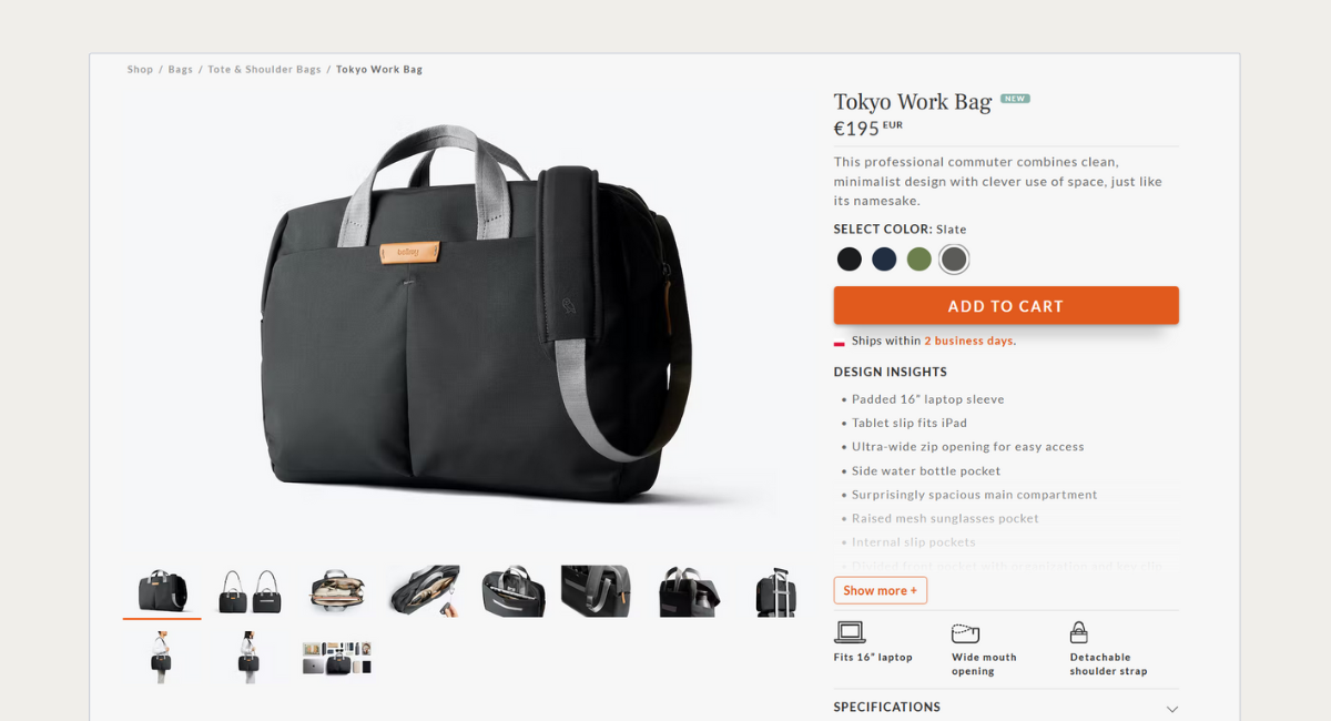
One of the smartest investments you can make in your e-commerce business is related to proper product presentation. The more detailed the picture, the more attractive the product itself is in the customers' eyes and the greater the likelihood that they will place an order. This is especially relevant to those businesses that sell physical products. Great imagery on product pages is the equivalent of a beautiful product presentation in a brick-and-mortar store.
You cannot replace the smell of your product or the feel of its texture with a photo, you also cannot re-create online that moment when a customer walks into a physical store and sees your product on a dedicated, well-lit display surrounded by an equally well-arranged number of matching accessories, but with the right approach to images and video, you can get close.
The use of high-quality photos ensures a higher conversion rate (and less disappointment that could lead to more returns) and is therefore considered one of the UX best practices. Poor images reflect a need for more investment and care for product presentation. Using low-quality pictures quickly gets your customers thinking: "If a brand doesn't care about pictures and videos on its website, what's the product quality?"
In the e-commerce world, you have to think about two types of images. The first category refers to product photos. Don’t rely just on pack shots made by the manufacturer – take your own pictures showing what’s the product really like.
The second category comprises stock photos. They can enrich your content marketing strategy and attract the attention of potential customers. You can find millions of stock photos, both free for commercial use and paid. Take a look at Unsplash and Pexels for free “stocks”, and at Shutterstock and GettyImages for paid ones.
Other image-related features and tips
Zoom-in feature, videos
By now, it is pretty much a standard to offer a zoom-in feature. Make it visible on your design, and make sure it is intuitive to use. Usually, a simple magnifying glass icon does the job. Should your product be innovative, high-end or simply if it could benefit from showing it in use, put a video in the product tab, and ensure it's clearly marked (for example, with a "play" button over the image) in your design.
Show products with context
If videos are not something your website can display, your customers would usually appreciate showing the product in some sort of context (e.g., earrings pictured on an actual ear to give the visitor an idea of its size, a washing machine standing in a real or rendered bathroom setting to visualise whether it could look equally well in your customer's house and so on).
Include user-generated images in your design
If your company operates in the fashion, design, food, sport, wellness or travel industry, you may also wish to include user-generated images in your e-commerce website design. Make sure these are also marked as UGC (user-generated content), and credit is given to those who created them. You may wish to make room for a dedicated plugin that will pull images with a certain hashtag from Instagram or you could also create a gallery of curated images selected from submitted pictures by your staff.
A great place to feature your user-generated product image is also the reviews section. By adding a photo to their review, customers can help others imagine the product in real life setting instead of a studio, which can result in a real decrease in return rates for you.
Experiment with AI-powered tools
If you are in fashion and would like to take this experience to a completely new level, though, think of implementing an AI-powered virtual try-on app such as Zyler which allows a visitor to see themselves instead of a model in actual product listings.
Use the live chat to improve customer service
A live chat feature and/or a chatbot is an excellent way to improve your conversion rate. Think of it as your digital sales assistant. Just like in a brick-and-mortar store, a visitor that needs help or has questions can talk to an advisor or chatbot at any given time. This solution proves particularly useful on the checkout page.
According to 99firms.com, online retail has a 34% acceptance rate for chatbots by customers, and you can be sure that this rate will only rise over time. The same source indicates that about 37% of people use chatbots to get quick help in an emergency[7].
Take care of the mobile version of your website
People want to browse e-commerce websites as conveniently as they browse social media. Nowadays, we may use laptops or desktop computers at work, but we spend way more time on mobile devices. The website's availability for shoppers on both desktop and mobile devices is an essential part of the user experience and is one of the most critical facets of e-commerce UX.
7.3% of total retail in the US came from mobile e-commerce in 2021. In the UK, that figure was 15.6% [8]
Make sure your e-commerce store is optimised for each device type. Both mobile and desktop versions should be equally well-polished in terms of UX best practices. For example, consider how your product filters will work on mobile devices. Sometimes the mobile version requires specific adjustments, like the additional "apply" button that doesn't exist in the desktop version. Adding a "go to the top" button can also be beneficial. Scrolling a website on a mobile device might become a challenge, especially when you want to go back to the very top of the website. In such a situation, this button might be a TOP feature on your website (pun intended).
Are you curious whether your website is mobile-friendly? Use this free tool provided by Google.
UX for product pages
Product pages are of immense value to your business success. In some instances, they can be even more significant than the homepage. It is usually the product page where your customers consider whether to place an order or leave your store. In order to convince them to purchase, make sure they are provided with all the information they need.
Key e-commerce UX elements of product pages
Clean lay-out
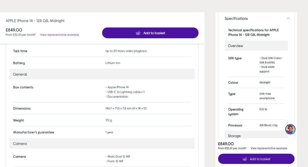
The most important part is a straightforward lay-out, the product name and technical details (e.g., colour, size and availability), a concise and precise product description along with high-quality, zoomable images and, of course, a clearly displayed price. The user should also be able to quickly and easily add the product to the cart.
Attributes
Remember to enhance product information with structured attributes. This way, you can easily turn them into filters in your search engine. If the important information sits in the product description only, it doesn't provide any value during the more advanced search.
Nice-to-haves
The rest of the items on your product page can be divided into two categories. Let’s call them nice-to-have elements and fancy features. To help you better understand what these categories are, we have put together these handy lists:
- Product reviews and the possibility to filter products by their ratings
- Additional product images (detailed views, animated images of the product in use)
- Product videos
- Related product recommendations
- User-generated content: Product reviews of images or videos from customers
- Wish lists
Here’s a good example of a product video:
Fancy features
These elements may be useful for some products, but only if they are flawlessly designed with high usability for e-commerce UX. Typically used by the largest stores. Examples:
- Virtual try-on (available thanks to augmented reality)
- Voice search and smart assistants
- Image search
- Subscription purchases
- Product customisation
Let’s look at two examples of such features in action:
 source: Nike By You
Nike By You is a service allowing to design, build and order your fully personalised Nike sneakers and running shoes. The customisation options are almost endless.
What about AR? An increasing number of online stores use augmented reality to showcase their products in a more interactive way. Look at this example from Gucci:
Zyler is a great virtual try-on feature that lets you see the products from various stores (both online and offline) with you as a model. It is being used by high-end boutiques such as Froxbox or Valentine Avoh. Many home décor stores, such as Made.com, make a virtual designer feature available to their users. Why spend hours browsing Pinterest for ideas if you could design an entire space in your home in half an hour and purchase all selected furniture and decoration straight away?
Let users compare products
Comparing two (or more) products or product variants your prospective customer considers is a great way to reassure them that they are making the right choice. Maintain consistency and logic in product information, especially the parameters. Keep everything transparent and easy to compare with an “add-to-comparison” button or link easily recognisable.
Support users and anticipate questions
Your product page should be a complete source of information about the product. However, each user is a different person with slightly different preferences. Therefore, you can expect questions about issues not covered by the product description, filters or images. Therefore, make sure you provide them with clearly displayed information on prices, delivery time, shipping costs, and warranty. Are you ready to take the next step? Introduce a section with FAQs about each product that your customers themselves could even popularise!
Don't forget CTAs
CTAs (call-to-action buttons) are one of the most critical components of effective product pages. A goal of a well-designed call to action button is to make it clear for the page visitor what they should do next. To make sure it works, you need to make your CTA clear, visible and readable. A good CTA is a button that contrasts with the rest of the e-commerce website without obstructing navigation.
Call-to-action examples to use on a product page are:
- Buy
- Buy Now
- Add to Cart
- Purchase
In case of another action is required from the visitor (prior to the purchase or after), your CTAs could also prompt them to perform it; for example:
- Select size (or another variation)
- Choose a plan (in case you are selling subscription-based products)
- Pre-order
They all seem rather straightforward – and that is the key. While choosing the best phrase for your call-to-action button on the e-commerce product page, do not try to overcomplicate it. There is truly no need to make it creative or special. To make it even clearer, ensure the call-to-action button contrasts with the colours used on the site and is high in the page's visual hierarchy.
If it's not absolutely necessary (e.g., crucial to the business model or the specifics of the product on offer), only place one CTA button on your product page. This way, you will minimise the chance of visitors getting confused and abandoning the process.
Boost your website's e-commerce user experience with NoA’s help!
The features listed above are just the starting point. Implementing these guidelines and tips on your website will help you satisfy your customers and attract more traffic, but you may already wish to go beyond basics. Drop us a line, and let us help you create a winning UX for your online store. Our goal is always to optimise the conversion process, increase sales and develop our clients' e-commerce businesses.
Bibliography
- [1] https://uxplanet.org/the-value-of-ux-design-bc22bcd482a4
- [2] https://uxdesign.cc/7-findings-that-prove-the-importance-of-great-ux-6a20682abf80
- [3] https://neilpatel.com/blog/loading-time/
- [4] https://aheadworks.com/blog/ecommerce-social-logins
- [5] https://theamericangenius.com/tech-news/ux-critical-every-1-invested-ux-yields-2-100-return/
- [6] https://www.myinspiredesign.com/editors-note-people-ignore-design-that-ignores-people-frank-chimero/
- [7] https://99firms.com/blog/chatbot-statistics/#gref
- [8] https://www.businessofapps.com/data/ecommerce-app-market/

Book expert consultation!
See what can be done to improve your online store, attract more customers and provide seamless UX.
Authors

Kamelia Niemczyk-Szczygieł
Senior UX Designer
Kamelia is a Senior UX Designer with 7+ years of experience in research and interaction design for international customers. She specializes in solving strategic and operational challenges with a strong focus on team collaboration.
 LinkedIn
Małgorzata Radkiewicz
e-Commerce Strategist
Małgorzata’s 15 years of experience have seen her delivering effective solutions to ecommerce brands of all shapes and sizes across the EU and UK. Małgorzata is experienced in brand positioning, traffic and ecommerce sales analytics and leading ecommerce teams and projects for B2B and D2C businesses.
Related articles
![Medieval people at the market – a painting in Pieter Breugel the Elder style generated by AI.]()
December 15, 2023 / 3 min read
Stop 'crying wolf': Insights from Black Friday 2023 in the UK
Black Friday and Cyber Monday, pivotal moments in the UK's retail calendar, mark the start of the festive shopping season. Every year, IMRG – the UK Ecommerce Association - collects...
![A stage with a large screen from the Opticon conference.]()
December 11, 2023 / 4 min read
Everything you might have missed from Opticon 2023
We recently participated in Opticon in the UK and Sweden, and we’re eager to share our insights on the latest developments to Optimizely. This year has brought some exciting changes,...

