Doconomy: A mobile banking app to tackle climate change

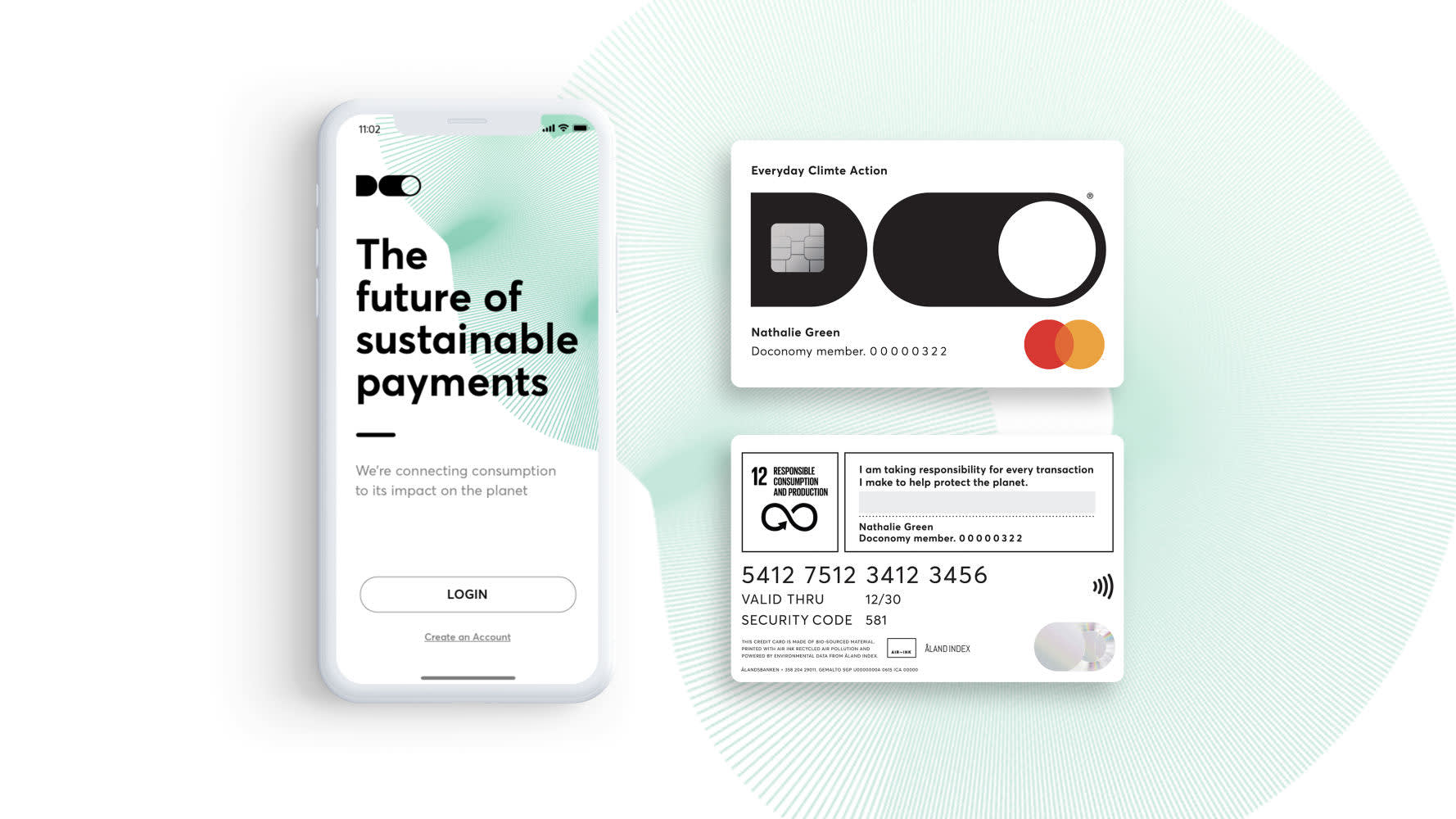
DO by Doconomy is a free, easy-to-use mobile banking service on a mission to do something about the climate crisis. NoA Ignite developed the first version of the app.
About the project
Doconomy was founded in 2018 as a start-up with its sights set on tackling the climate crisis. Their vision is to empower individuals to contribute to everyday climate action. Since the beginning, they’ve been working on an ecosystem of financial tools to drive positive change.
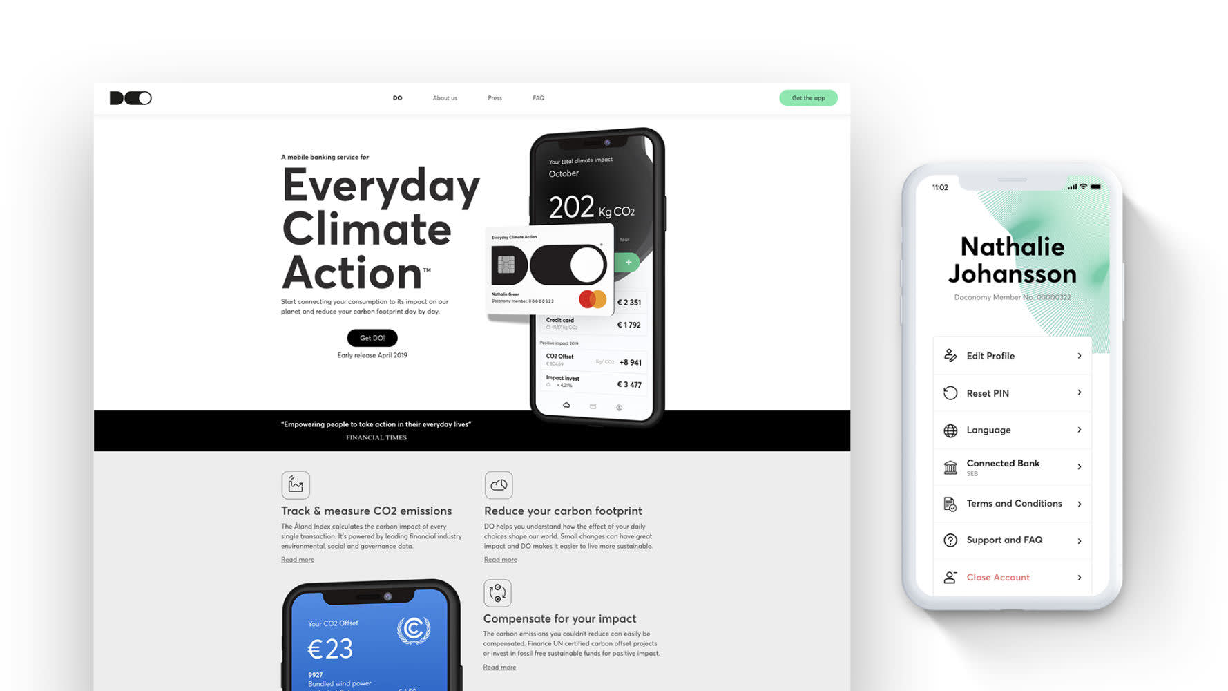
NoA Ignite developed the mobile banking app DO, which allows people to calculate their carbon footprint. It was one of the first products in Doconomy’s ecosystem.
App dev tools
- Xcode
- WebStorm / MS Visual Studio Code
- React Native Debugger
Backend dev tools
- MS Visual Studio 2017+
- LocalDB / MS SQL Server
- Azure Storage Emulator
- Azure CLI
- AWS CLI
- Soap client (i.e. SoapUI)
- Azure VPN
Backend dev tools
- MS Visual Studio 2017+
- LocalDB / MS SQL Server
- Azure Storage Emulator
- Azure CLI
- AWS CLI
- Soap client (i.e. SoapUI)
- Azure VPN
The collaboration
Responsible for development, design, UX writing, and project management, we developed the DO app in English and Swedish. The project was delivered successfully thanks to our teams in Krakow and Stockholm:
- Developers (Krakow)
- UI/UX design (UX writers in Krakow and designers in Stockholm)
- Business / delivery managers (Krakow and Stockholm)
The team was engaged with the MVP (minimum viable product) for a total of 18 months.
To allow people to create an account and order the credit card, the app was connected to Doconomy’s partner bank Ålandsbanken.
Challenges
The MVP should allow people to:
- Track their CO2 footprint
- Compensate for the environmental impact through UN-certificate projects
- Set up a sustainable savings account
- Order a DO credit card
Development changes
This was a dynamic project that changed direction a few times along the way. The change from Azure to AWS, for example, required a high level of creativity and problem-solving skills by the whole development team.
Setting up a UX writing process
A challenge for the UX writers in Krakow was to establish a process and routines with the designers, who were all located in Stockholm. The original setup (design in Sketch, UX copy in Excel) made it hard both for the UX writers and for the bank and legal representatives who reviewed the copy.
We also had to think carefully about a suitable voice and tone, including guidelines on how to deal with banking and climate-related terms. The goal was to create clear and engaging UX copy that would be accepted by the bank’s legal team.
Our approach
With a large team in two locations, it was vital to ensure good communication both within NoA Ignite and with Doconomy.
The two NoA Ignite offices worked closely together and had regular calls and meetings:
- Daily stand-ups
- Bi-weekly requirements refinement + prioritization meetings
- Bi-weekly sprint summary + demo meetings, sprint planning
Tools like Azure DevOps, Confluence, and Slack helped us to keep on top of everything.
We also met frequently with Doconomy staff and other important stakeholders, including finance and legal representatives at Ålandsbanken.
To improve the designer/writer collaboration, we suggested switching to Figma. This turned out to be a great move. Working with the copy directly in the design helped not just the UX writers but also the designers, Doconomy staff, and the bank reps who reviewed the copy.
The outcome
The DO app was the first tool launched by Doconomy. Released in Sweden (in Swedish and English), this mobile banking service helped people make a positive impact on the environment.
We were delighted to be able to contribute to a fintech solution for such a worthy cause. As our contract was restricted to the MVP, we do not have access to statistics that measure the impact of our work. We were however delighted to hear that Doconomy received several awards in 2019 and 2020, including the Cannes Lions Grand Prix!
Any questions?
Contact us!
Our services

Strategy and Innovation
- Digital Strategy
- Innovation Process
- Content Strategy
- Technical advisory
- Ecommerce strategy
E-commerce
- Pre-implementation analysis
- Consultancy and strategy
- Development
- Analytics and data integrations
- E-commerce Healthcheck
Experience Design
- Audit & Research
- Customer Journey Mapping
- Prototyping and User Testing
- UX & UI Design
- Copywriting & Content translation
- UX writing

Enterprise CMS
- CMS advisory, platform selection
- Web development
- 24/7 Support and Customer Success support
