What is accessibility and why it matters?
June 17, 2025 / 5 min read

Accessibility ensures everyone — including those with disabilities or limitations — can read, navigate, and engage with your content equally.
Most people don’t think twice about opening a PDF, reading a report, or clicking through a document online. But for millions of people living with disabilities, low literacy, using older technologies, and experiencing other limitations, these simple tasks can become barriers - unless we design with accessibility in mind. Accessibility means making sure everyone can read, navigate, and understand your content, no matter how they interact with it. That includes users who rely on screen readers, keyboard navigation, or voice commands. When you make your content accessible, you’re not just following the rules - you’re showing that you care about inclusion and equal access.
Digital accessibility isn't just about meeting the needs of people with permanent disabilities — it's about designing for real life. That means supporting users who are older, navigating a site on a phone in bright sunlight, using a slow internet connection, recovering from an injury, or reading in a second language.
It also means accommodating people who don't identify as disabled but experience barriers, like age-related vision changes or tremors. By making digital experiences more accessible, we’re not only practicing inclusion — we’re future-proofing our content for the wide, messy, wonderfully diverse ways people interact with technology every day.
Why accessibility matters
There are two big reasons why accessibility should be on every organization’s radar. The first is inclusion. Accessible documents and websites ensure that people with visual, motor, or cognitive impairments aren’t excluded from critical interactions — whether it’s reading a public report, using an app, or signing a contract.
The second reason? It’s the law. Standards like WCAG, the European Accessibility Act, ADA, and Section 508 require accessible digital content across many sectors. But beyond compliance, accessibility improves clarity and usability for everyone — often resulting in cleaner, more organized, and more user-friendly content.
From a business perspective, accessibility is more than a checkbox — it’s a competitive advantage. It drives innovation by encouraging design that solves real-world problems in unexpected ways. It enhances brand reputation by aligning with diversity and inclusion values that matter to both customers and employees. It also expands your market: over 1 billion people globally live with a disability, representing more than $6 trillion in spending power. And as digital accessibility becomes a growing legal requirement worldwide, prioritizing it today helps minimize risk tomorrow.
Who should care about PDF accessibility and why
If your team creates documents, especially in IT, compliance, legal, or communications, this topic is directly relevant to your work. Why? Because PDFs are everywhere.
- Policy documents, terms and conditions, financial reports, onboarding materials. And if these aren’t accessible, you’re unintentionally creating a barrier for some of your users or employees.
- For public institutions and large enterprises, this isn’t just a technical detail. It’s a matter of legal risk and brand reputation.
- For internal teams, inaccessible documents can mean wasted time, miscommunication, and frustration. In short: this isn’t just about "doing the right thing." It’s about doing things right.
What accessibility actually involves
So, what makes a PDF accessible? It starts with things that are easy to overlook, like giving the document a proper title, setting the primary language, and using clear, consistent headings. These small details make a big difference for users relying on assistive technologies like screen readers. Without them, the software might read the content out of order, mispronounce words, or skip key sections entirely.
That’s frustrating at best — and discriminatory at worst. Structuring your document properly is the foundation of accessibility, and fortunately, most of it can be done right inside Word or your document editor of choice.
Businesses that overlook accessibility don’t just risk inconveniencing a few users — they risk alienating entire audiences. When someone can’t read or interact with a PDF because it’s poorly structured, the consequences ripple outward. It may cause stress or anxiety for the user, waste their time, and even compromise their privacy or security.
For the organization, this could mean damaged reputation, lost revenue, and in some cases, legal action. Prioritizing accessibility is not only a way to foster trust and inclusion — it’s also a safeguard for your brand.
Making images and visuals accessible
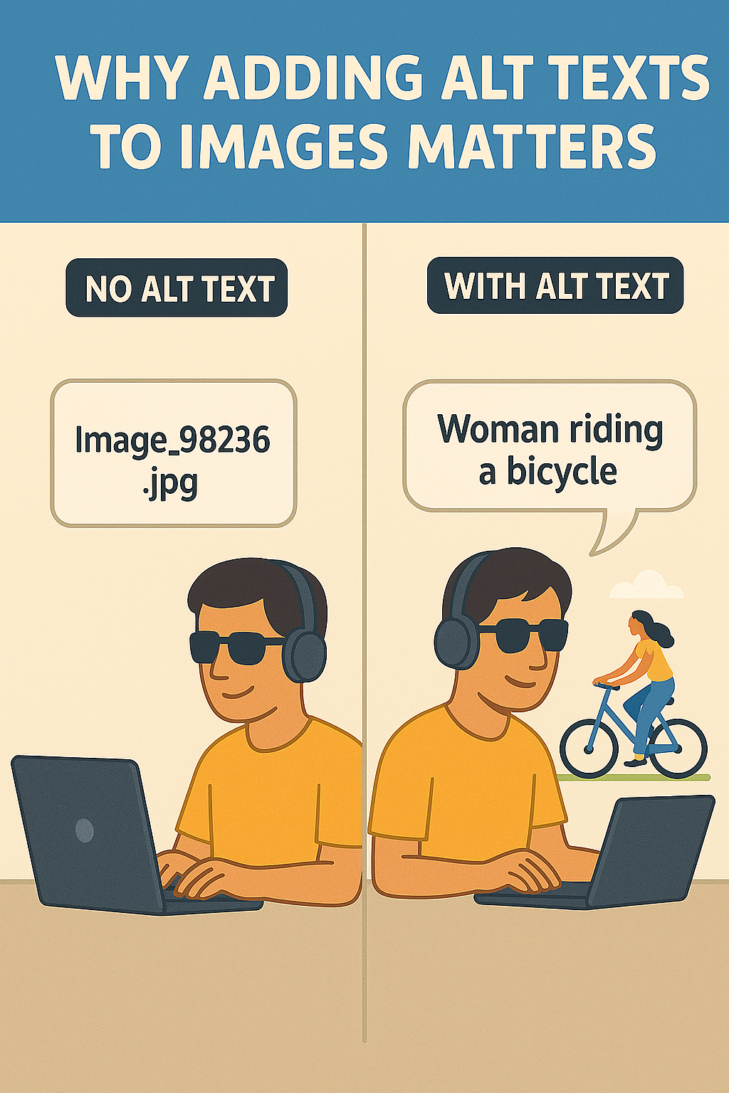
Visuals like images, charts, and infographics can add a lot to a document, but only if everyone can understand them. That’s where alternative text (or “alt text”) comes in. Alt text provides a short description of what an image shows, so people using screen readers can get the same information as everyone else.
Without it, they’re left guessing. It’s a simple fix: right-click the image, choose “Edit Alt Text,” and write a clear, concise description. And if the image is purely decorative? Just mark it as such. That way, the screen reader can skip it, keeping the experience smooth and focused.
Navigation, structure, and making content easy to move through
Accessibility isn’t just about what’s on the page, it’s about how people move through it. That’s why things like heading styles, tab order, and lists matter so much. Proper heading levels (like Heading 1, Heading 2, etc.) give screen readers a roadmap for the document.
Without them, it’s like navigating without street signs. Tab order ensures that people using a keyboard can move logically from one section or field to the next.
And lists? They need to use built-in formatting - not just manually typed numbers or dashes - so assistive tools can interpret them correctly. These are all small habits that make a big impact.
Tables and color contrast
Tables are a great way to organize data, but only if they’re structured right. Screen readers need clear headers to understand the rows and columns, and that means using the “Header Row” setting and avoiding tricks like merged or split cells.
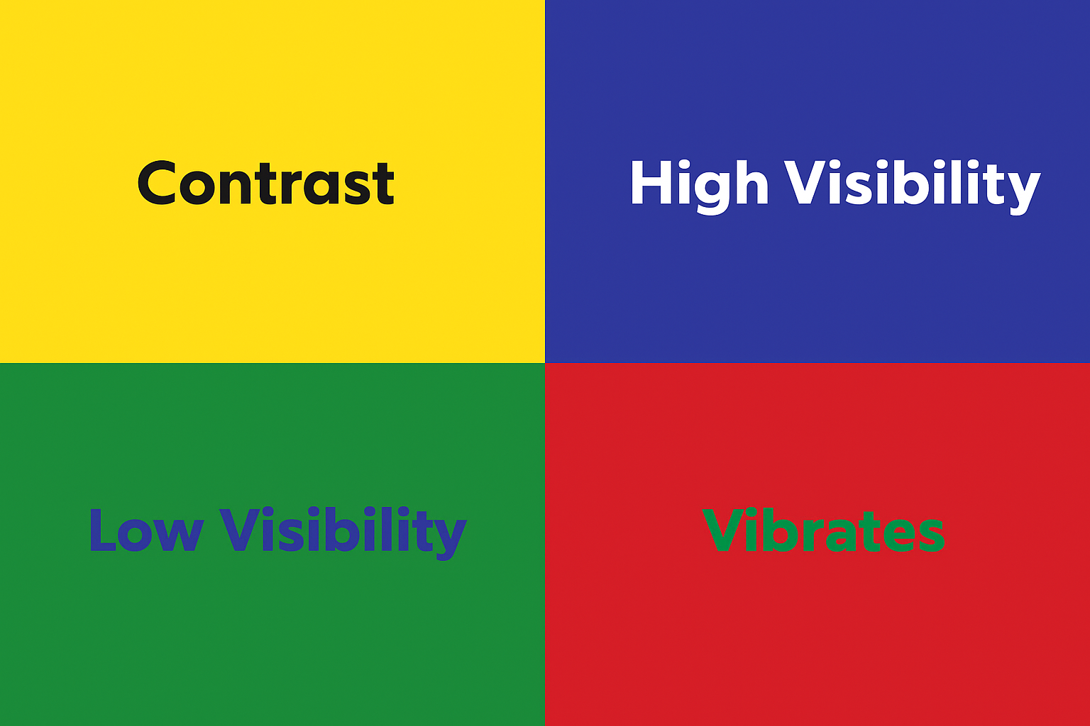
Irregular tables confuse assistive tools and make the content hard to follow. The same goes for design choices like color. If you rely on red text to show an error or use pastel colors for key figures, you’re excluding users with low vision or color blindness.
Always pair color with text labels and check your contrast. High contrast = better readability for everyone.
Testing and exporting accessible PDFs
Even with the right structure and formatting, your document isn’t fully accessible until it’s been tested. Tools like Microsoft Word’s Accessibility Checker can flag common issues - missing alt text, incorrect tab order, or inconsistent headings.
It’s quick, built-in, and worth the extra click. And when it’s time to export, make sure you don’t lose all that good work. Always choose “Save as PDF” with accessibility options enabled - this keeps your document tags, alt text, and structure intact.
If your version of Word offers “Save as Adobe PDF,” that’s even better. Accessibility isn’t just about what you write. It’s also how you publish.
Key takeaways
Accessibility isn’t just a checkbox — it’s a mindset and a smart business strategy. When your PDFs are accessible, more people can read, understand, and act on your content. You open doors instead of closing them, creating inclusive experiences for people with disabilities, older adults, mobile users, and anyone interacting in less-than-ideal conditions.
The benefits go beyond usability. Accessible content reduces legal risk, protects your brand reputation, and expands your reach to over a billion people globally — a market worth more than $6 trillion. It also signals that your organization cares about inclusivity, innovation, and doing things right.
At NoA Ignite, we help you turn accessibility into a strength. From quick assessments and PDF remediation to full-scale audits and implementation strategies, we work with teams across industries to make their digital content more inclusive, compliant, and effective. Whether you're starting from scratch or scaling existing efforts, we’re here to guide the way.
Curious where you stand? Let’s talk.

Discover how you can make your business more sustainable.
Author
Related articles
![A well-crafted prompt doesn’t just work once. It works across teams, channels, and campaigns. It can be tweaked for new use cases and refined based on what performs best.]()
June 27, 2025 / 4 min read
Prompts are marketing assets: how to reuse, and scale them
Prompts aren’t throwaway lines. They’re repeatable, scalable assets that can streamline your marketing your team’s output. Learn how to build a prompt library that delivers.
![Project manager working at a desk with a laptop and documents.]()
June 16, 2025 / 9 min read
What can you expect from your partner in terms of DXP?
Customer Success means more than launching your DXP, it’s about driving ongoing growth with clear goals and the right support.

