
Today, we’re going to talk about website navigation. Without a doubt, website navigation design is extremely important – it allows both your customers and Google bots to get acquainted with your webpage’s structure and content. And then, we have the UX question to make everything clear and intuitive. In this blog post, we will show you website navigation best practices. We will also present some of the website navigation examples. Let’s get right to it!
If you’ve never designed a website for your company, this task can seem quite straightforward. However, there are several website navigation design commandments and best practices that help designers create websites that are compelling and easy to use, even for less tech-savvy users.
Why is proper website navigation so important
For starters, without it, your website will appear as unstructured and messy. When you enter a website, you want to know what it contains and what can you find out on it, right? More often than not, users visit various websites because they want to:
- Find an answer to a specific question
- Discover the product they are interested in
- Order a service they need
- Compare different options before making a decision
- Broaden their knowledge
These goals are all very specific. No one wants to waste time browsing a website just to find out what it’s about. We could even say that if the given website doesn’t offer what you need, you will quickly leave it and go elsewhere. And that’s, in short, why proper website navigation design is so important – because it facilitates achieving your customers’ goals and fulfilling their needs.
How to define web navigation
Website navigation comprises all the elements that enable its visitors to move around it and find out what’s it about. There are several crucial elements that make up website navigation design:
MENU
It’s almost always in the upper part of the website. The menu should contain all the subpages and important sections that you want your customers to visit. A properly designed menu cannot be overloaded; many experts say that seven elements in it are your maximum. Let’s take a look at different examples of a website menu:


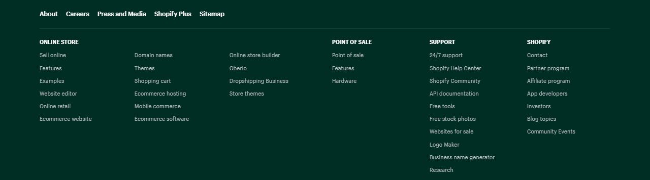
NAVIGATION BAR
The navigation bar plays, in general, the same role as the menu, but there are some differences. First off, the menu allows submenus, while the nav bar doesn’t. It’s also usually located in a different place on a website, frequently in the footer. Take a look at this navigation bar made by Shopify.com:
FOOTER
Although it’s at the very bottom of each website, the footer can also play a vital role in website navigation! It can contain the company’s contact information as well as CTA buttons and contact forms. So if a given user is interested in contacting you, they don’t have to go all the way up; click the “contact” button and go to a different section. It’s all readily available in the footer. Take a look at this example of a well-designed website footer (Brand24.com):
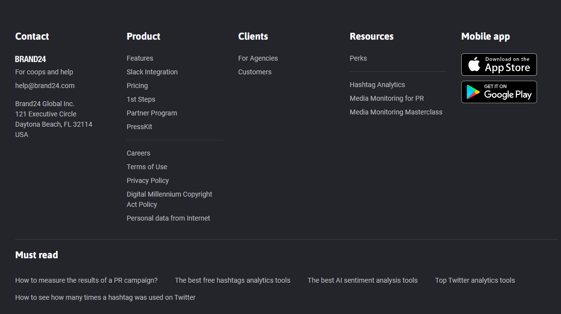
Here, you have everything you need – contact details, main website sections, additional resources and even buttons enabling you to download their app.
HEADERS
Headers are a part of every blog post and subpage on your website. Typically, they are marked H1, H2, H3 and H4, with H1 being the most important and H4 – the least important. H1 is usually a title of a specific website or blog post. Headers are extremely important from the SEO perspective, because they allow Google bots to understand what a specific subpage is about.
SITEMAPS
Although sitemaps aren’t easily accessible to ordinary users, these small files can be useful from the SEO perspective. You use a sitemap file to provide detailed information about all the pages, media files, news content and other elements on your site and correlations between them. Google bots use those files to crawl your website effectively. In other words, a sitemap allows Google crawlers to understand what’s important on your website and how it should be indexed [1].
Of course, depending on the type of your website, there are other navigation elements, e.g., search box, which is a must-have in an e-commerce world.
Why is proper website navigation so crucial?
Back in 2018, Clutch.com conducted a Consumer UX Survey where they asked respondents about the most important elements of every website. Here are their answers[2]:
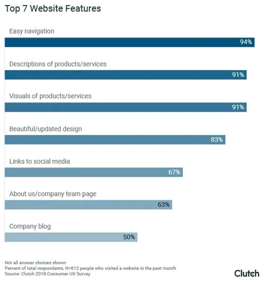
Easy navigation is an undisputed number one with almost 95% of answers. And yes, that study was conducted nearly four years ago, but today, these answers would have been very similar because it’s not about changing trends or different technologies. It’s about the way we consume information, which is pretty much the same.
Websites with easy and well-designed navigation:
- Get better visibility in Google
- Retain visitors for longer
- Get better opinions among users
- Facilitate your marketing and sales efforts
And yes, proper website navigation design can help you get more customers and turn them into regular users. Of course, navigation is not a sales tool per se, but it surely streamlines your efforts. Remember that users can be triggered or discouraged to take action by a seemingly small element. Don’t let your website navigation be a discouraging part of your website! To help you avoid that scenario, we’ve made a list of website navigation best practices. Follow them, and your website will be easy to use and intuitive.
Website navigation best practices
EVERYTHING HAS TO BE USER FRIENDLY
That’s the prerequisite for every successful website design. Think about your users and their needs. If they look for your products – put them at the forefront. If they quickly go to the “about me” and “contact” section (because, e.g., you offer consultancy) – start with that. Your first step always should be to think, “what do my users need on my website?” And then give them just that.
BE DESCRIPTIVE
The first thing you have to consider is the subpages' names in your menu. Usually, it's better not to use "services" and "products" names. Be specific. Name your "services" section "digital marketing" if you offer marketing services. If you sell leather shoes, go for "leather shoes" not "products". This way of labelling menu sections will help you get better visibility in Google.
AVOID DROPDOWN MENUS
It's a type of menu where a new list of options drops down after placing a cursor on a specific section. Usually, it doesn't work very well. The only exception is when the dropdown menu is really expanded, and there's no other way to squeeze all these subpages elsewhere.
GROUP ITEMS
If your menu or nav bar is too long, group items in it into sections. If, for example, you offer cleaning services and you have sections for different surfaces (e.g. floors, windows, wood, etc.), you can create one big section called “surfaces”.
USE YOUR LOGO AS A “HOME” BUTTON
Putting "home" in your menu takes up precious space. Instead, you can put a small house icon or use your company's logo (that has to be there either way) as a homepage button. Don't worry; users usually already know that "trick", and the lack of the "home" button in your menu won't be a problem.
ADD A SEARCH BAR
If your website structure is complex because you offer many different products and services, it’s always helpful to add a small search bar. This way, customers looking for something specific can find what they need easily. As we mentioned earlier, search boxes are necessary on e-commerce websites, but they work well with service websites, too.
TAKE CARE OF YOUR MOBILE NAVIGATION
You can’t forget about the navigation design in your mobile website. Here, things work a bit differently. For starters, you have far less place, so use it wisely. Secondly, make sure each box and link as enough space around it so that no one clicks anything accidentally. Thirdly, make sure each bar and button is easy to find and big enough (remember about older or less tech-savvy users).
MAKE YOUR FOOTER RICH
As we told you, the footer is at the very bottom of your website, so making it extensive won't hurt anyone, and you have the opportunity to put everything that's important in there. Footer is perfect for placing your:
- Contact details (along with Google Maps)
- CTA button (leading to a contact or order form)
- Main products/services
- Prizes and awards
- Privacy policy and terms of services
The importance of internal links
Lastly, we want to talk about internal links. They are also valuable, both from your customer's and Google's perspective. Internal links enable you to link (and direct users) between important sections on your website. Let's go back to our shoe store example. You can place a link to a blog post explaining how these shoes should be maintained and cleaned in your product tab. You can put another link to a section with shoe accessories etc.
Internal links shorten the time necessary to navigate through your website. But they play a vital role in SEO as well. Google uses internal links to assess what your website is about. Google bots follow your links (both internal and external) to discover content on your website and rank it in the search results. The more valuable internal links you have, the better. The well-linked site will have better chances of ranking higher in the SERP (search engine result page).
Typically, the homepage has the highest link value. Therefore, all the important elements on your website should have a direct link from the home page. Similarly, if you want to promote your latest blog post quickly, make sure there's a link to it on your main website and not just in the blog section.
Summary: Website navigation design
We hope that this blog post was helpful. If you want to know more about designing modern, good-looking websites, read these posts on our blog:
They will broaden your knowledge. Always remember to put the customer in the very centre of whatever you do. Concentrate on your users’ needs and facilitate navigating through your website. This way, you will get their appreciation and Google recognition.
And if you need help with navigation design on your website – the NoA Ignite Team is at your service! You can drop us a line and tell us how we can help enhance your online presence. We’ll take it from there.
[1] https://smallbiztrends.com/2019/01/easy-website-navigation-is-important.html

Book expert consultation!
If you want to talk to our experts about this article or related question – just reach out!
Author

Related articles
![A well-crafted prompt doesn’t just work once. It works across teams, channels, and campaigns. It can be tweaked for new use cases and refined based on what performs best.]()
June 27, 2025 / 4 min read
Prompts are marketing assets: how to reuse, and scale them
Prompts aren’t throwaway lines. They’re repeatable, scalable assets that can streamline your marketing your team’s output. Learn how to build a prompt library that delivers.
![Woman using a wheelchair in the office settings]()
June 17, 2025 / 5 min read
What is accessibility and why it matters?
Accessibility ensures everyone — including those with disabilities or limitations — can read, navigate, and engage with your content equally.

