Web accessibility: grow your business by making your customers’ lives easier
September 21, 2022 / 9 min read

Have you ever wondered about how to reach a larger group of consumers? The solution would be to provide those who are already interested with a better user experience. Satisfied users are more likely to return, so why not meet their expectations? As simple as it sounds, many websites are still built in a way that is not accessible to everyone. Even nowadays, people with disabilities face multiple difficulties online. On the other hand, business owners who ensure that disabled customers can access their websites, gain a lot of faithful clients. Additionally, implementing accessibility optimization generates cleaner interfaces and ensures more comfortable usage of the website for everyone.
Why web accessibility is important
As stated by W3 [1], “Web accessibility means that websites, tools, and technologies are designed and developed so that people with disabilities can use them.” It means that everyone should be able to “perceive, understand, navigate, and interact with the Web” as well as “contribute to the Web”.
Disability affects all of us
According to WHO, about 1 billion people are living with some form of disability [2]. It’s 15% of the world’s population. Additionally, many people experience temporary and situational disabilities like broken arms or being blinded by the sun. Improving the accessibility of a website ensures a better user experience in tougher circumstances.
Acting as a guiding light
Web Accessibility Initiative (WAI) of the World Wide Web Consortium (W3C) created web accessibility standards called Web Content Accessibility Guidelines (WCAG). These documents provide technical requirements for making digital products accessible and act as the prime reference for everyone who deals with this topic.
Promote inclusion with the A11y project
A11y project [3] was created as a community-driven initiative that gathers a variety of resources on building accessible websites. The main objective of this idea is to popularize inclusive web design so that as many people as possible could use websites even though they have some disabilities. Its name A11y stands for “accessibility”. It's an abbreviation where “11” refers to the number of letters between “a” and “y". The term is used widely in web development communities when talking about accessible features.
Laws standing on the guard of accessibility rights
Several countries including: Denmark, Finland, Germany, France, the United Kingdom, Netherlands, and many more, introduced legislation to protect people with disabilities from being discriminated [4]. Some of the regulations focus mainly on the public sector, but in several countries, for example, Norway or The United States, private businesses are also obliged to abide by them. When it comes to The European Union, in April 2019 The European Accessibility Act (EAA) was passed. It is required to be enforced by UE member states by July 2025.
Business benefits of making websites accessible
From a business perspective, accessibility means huge financial savings and, simultaneously, increasing revenues. It’s due to several factors:
- It prevents unnecessary lawsuits and accusations of discrimination
- It creates a positive image of your company and ensures branding improvement
- It helps you reach a wider audience by enabling a larger amount of people to use your product
- It improves SEO by increasing your website visibility which again expands your audience base
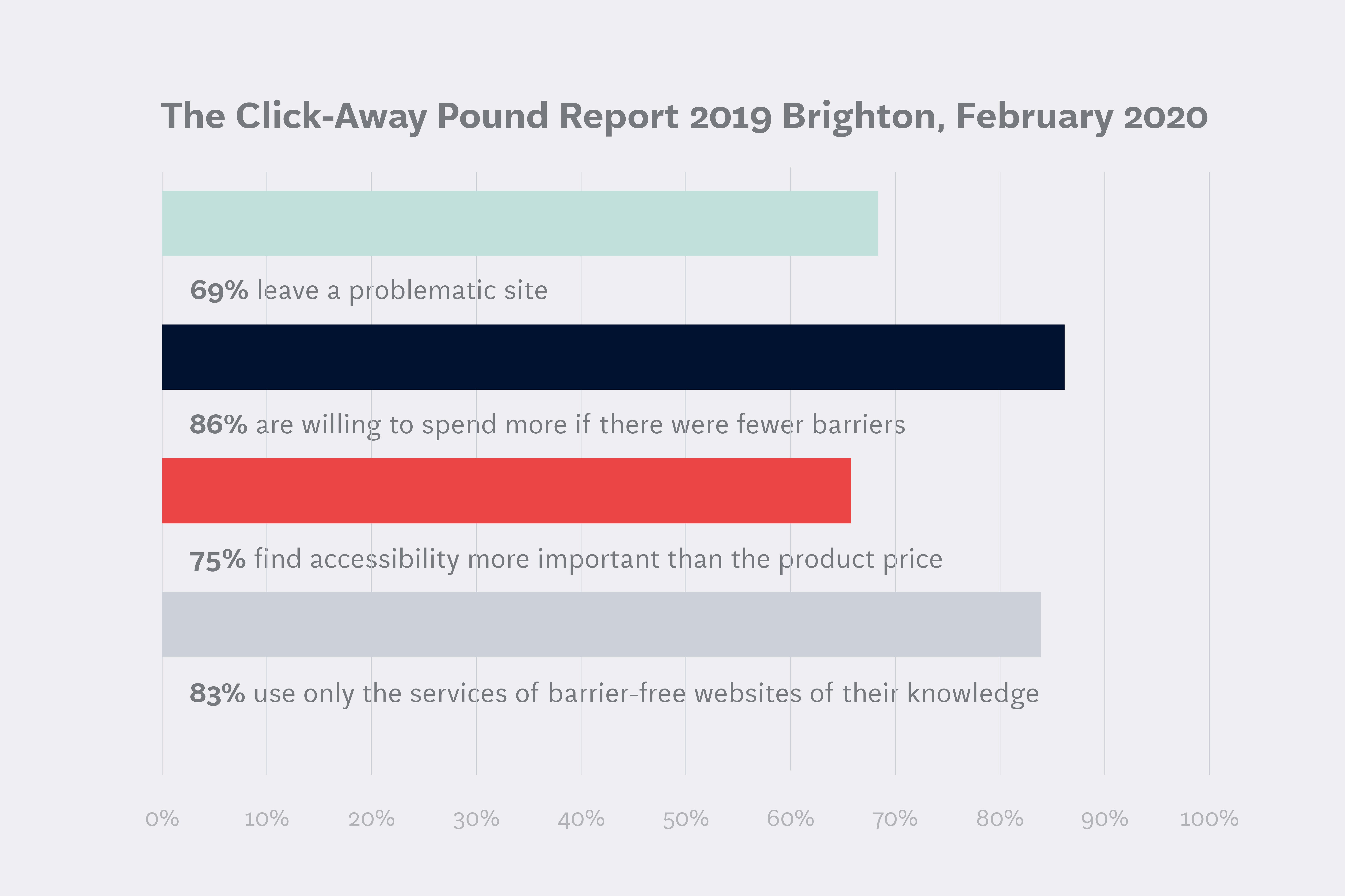
Numbers prove its worth
The study shows [5] the importance of introducing accessibility improvements. A large proportion of survey participants recognize accessibility features as a substantial factor that encourages them to use the services offered on the webpage.
- 69% leave a problematic site
- 86% are willing to spend more if there were fewer barriers
- 75% find accessibility more important than the product price
- 83% use only the services of barrier-free websites of their knowledge
It may be concluded that many companies lose a lot of money because of the loss of clients with disabilities. Including them instead would be highly beneficial.
How to design for accessibility
This process is not easy at all. It requires viewing designs from different perspectives and needs. There is a chance that we are not able to predict every single scenario, however, most of them can be secured. Jesse Schell in his book The Art of Game Design: A Book of Lenses [6] mentions several aspects which help to ensure that goal.
Animation and effects
Since high-intensity animations may cause photosensitive epilepsy and constant motion can be distracting or cause vertigo, designing safer animations is a recommended strategy. It means reducing the size of the motion, the distance covered as well as matching the speed and direction of other objects. Additionally, the user’s preferences should be respected by a no-motion-first approach. It ensures a non-animated alternative to effects if the user has picked the “reduce motion” option in their browser settings.
Audio and video
As a rule of thumb, videos should never autoplay without being muted. Surprising people with unexpected noise cannot be a pleasant experience. Videos autoplaying in backgrounds, despite being a recent trend, can be annoying and distracting, so users should be able to find some controls to pause them. Also, videos should have transcripts or subtitles so the user can choose the way of consuming the content.
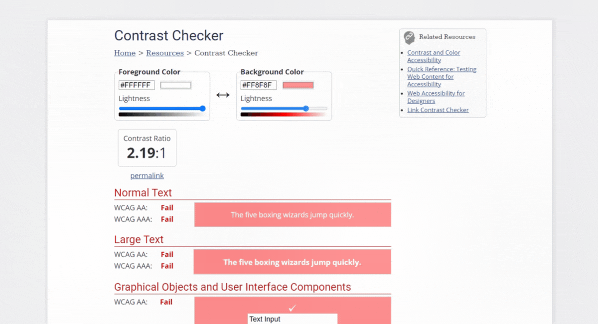
Color
People with low vision or color blindness may experience some difficulties in distinguishing between colors. As a result, foreground and background colors should meet a minimum contrast ratio of 4.5:1. However, colors shouldn’t be the only means of conveying the meaning. Other indicators should be also used, for example, underlines for links or icons for alerts.
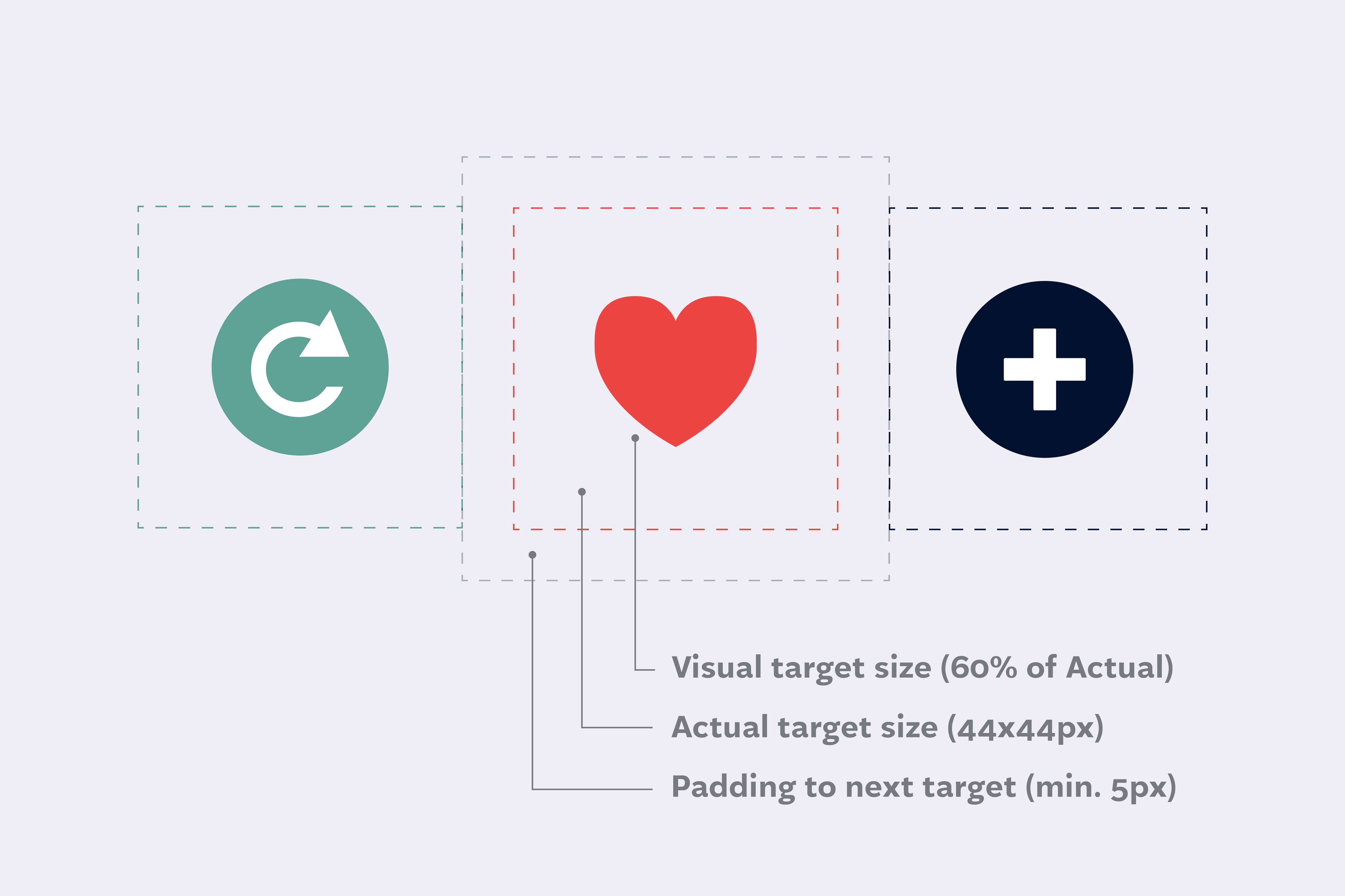
Controls
UI elements that users can interact with such as buttons, checkboxes, or links should be easy to click. It’s important, especially for people with tremors or vision problems. According to WCAG, the recommended size of the target for pointer inputs is 44 by 44 pixels [7]. Another essential aspect is spacing between controls. Microsoft suggests at least 5 pixels between controls for mobiles to prevent tapping unintended targets [8]. Clearly, accessibility issue applies also to touch screens. A fun fact worth mentioning is that the concept of a minimum 44x44px tap target was first introduced in the HUD Widgets app for mobile by Apple [9].
Font
While there is no official minimum font size for websites, it’s recommended to make it large enough so that users can read text easily. ADA proposes 16 pixels for the body, however, 12/14px seems to be also accepted when put under larger headers [10]. Font size should be also responsive depending on the devices used. Additionally, font style can also make a difference. Decorative and cursive styles may be difficult to read, so generally, sans serif fonts would be preferred. Moreover, the text should be resizable at least up to 200%.
Images and icons
Users should be provided with alternative text for images. It’s extremely important, especially for visually impaired people who use screen readers. This text should be descriptive enough to reflect the experience given by viewing the picture. Accessibility icons are also worth mentioning. Their purpose is to present information or functionality in a visual way that can be more understandable than text alone.
![]()
Keyboard
According to this survey [11], over 33% of respondents use a keyboard as their primary means of interacting with a web page. There are mainly people using screen readers or people with tremors, however, it’s quite common for everyone to use a keyboard because it’s faster than using a mouse. This shows the significance of designing accessible keyboard navigation. Typically, users navigate to each control using the tab key, so they should appear in a clear order. “Skip to content” links are also helpful as they prevent tabbing through numerous unwanted controls. Focus styles should always be visible so that the user doesn’t get lost. It’s recommended to replace default browser styles with more distinct ones.
Layout
The layout of the website should be concise and easy to follow. Users should be able to find the elements they want as quickly as possible. It’s crucial to put elements in their expected places, for example, typically, the navbar is at the top of the page, pagination is below the filtered content, the basket is in the top right corner, etc. Additionally, alternative ways of finding content could be used such as a sitemap showing the structure of the website or an internal search bar.
Material honesty
People base their actions and expectations on their mental models – their prior experiences. They reconstruct similar contexts and objects which helps them understand the current situation and they behave properly [12]. Therefore, following conventions regarding the appearance of UI elements ensures that users know what to expect. Moreover, one element shouldn’t act like another. For example, buttons and links have different behaviors and functions and should be easy to differentiate.
Readability
According to WCAG guidelines, text complexity shouldn’t demand reading ability more advanced than after 9 years of school. In case it is, supplemental resources are required to provide a wider context [13]. Moreover, an optimal line length should be between 45 and 80 characters. Lines that are too long make it difficult to stay focused, while ones that are too short cause fatigue in the eyes.
Structure
This survey [14] shows that above 60% of respondents use assistive technology. Half of them use a screen reader as their primary device. Therefore, making websites accessible for such devices is extremely important. How can we do that?
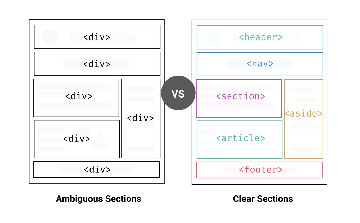
Semantic HTML
Websites are built of elements (tags) in HTML. Some of them don’t convey any special meaning – just create building blocks, but the others have built-in support for screen readers or keyboard navigation. They help assistive devices read the structure more efficiently. Meaningful tags should be used whenever possible, especially for interactive elements such as buttons, links, or forms.
For example, a tag "table" enables one to use/makes it possible to use (select one) arrow keys to navigate through a table and appropriate input types such as “email” or “tel” suggest to the user a relevant data type that should be entered into the form. Additionally, more than 67% of participants of this survey [15] navigate through the headings on the page for finding information. As a result, using the appropriate heading structure (h1 -> h6) without skipping any of them is crucial. Furthermore, specifying the natural language of the content by using the "lang" attribute in "html" tag affects the way a screen reader pronounces words.
ARIA
If for some reason using semantic tags isn’t possible or, if they don’t have the desired support, ARIA may be helpful. Its formal name is “Web Accessibility Initiative - Accessible Rich Internet Applications (WAI-ARIA).” It’s a set of attributes that may be added to HTML elements to make them more accessible.
How to check the accessibility of a website
If you want to improve your website accessibility, you need to test it first. The desired approach would be to divide the process into two steps.
Test website accessibility manually
There are some methods you can use right away to do some basic checks:
- Use a keyboard instead of a mouse to navigate.
- Check if the text is visible on backgrounds and easy to read.
- Resize the text to 200%.
- Confirm that the text is divided by headings.
- Check if it’s clear which elements are links.
- Make sure that information about the next steps (for example, when purchasing a product) is precise.
- Turn off the sound to see if the same information can be found (for example, if subtitles or transcripts are provided for videos).
Use web accessibility tools
You can also choose from many automated checkers that may provide a more thorough analysis:
- Color Contrast Analyzer, by Adobe (color.adobe.com/create/color-contrast-analyzer) checks color contrast ratio
- WAVE, by WebAIM (wave.webaim.org/) evaluates web accessibility of your page content within the browser and reports about the issues found
- Accessibility Checker, by Intent Based (usabilitygeek.com/10-free-web-based-web-site-accessibility-evaluation-tools/) scans websites for major legislations around the world
- Sa11y, by Ryerson University (sa11y.netlify.app/) visually marks errors and delivers suggestions on how to fix the issues
- Validator, by The World Wide Web Consortium (validator.w3.org/) checks semantics of HTML code
Accessibility as a key to success
When you find something disturbing or confusing on a website, even though you have no disabilities, you can be sure that the user experience for disabled people will be much worse. On the other hand, interacting with an accessible and optimized website gives more peace and joy to everyone. That’s why focusing on web accessibility can be a highly beneficial factor in business development. Satisfied customers mean higher profits.
If you are wondering whether your website is accessible, feel free to book a free consultation. We always make every effort to ensure that our products are user-friendly to everyone, including people with disabilities.
______________________________________
- w3.org/WAI/fundamentals/accessibility-intro
- who.int/news-room/fact-sheets/detail/disability-and-health
- a11yproject.com
- accessibilitychecker.org/guides/eaa-compliance/#accessibility-legislation
- clickawaypound.com/downloads/cap19final0502.pdf
- goodreads.com/book/show/3396933-the-art-of-game-design
- w3.org/TR/WCAG21/#target-size
- docs.microsoft.com/en-us/windows/win32/uxguide/inter-touch
- developer.apple.com/design/human-interface-guidelines/foundations/layout/#best-practices
- digitalauthority.me/resources/ada-compliant-font-size/
- webaim.org/projects/motordisabilitysurvey/#means
- frontiersin.org/articles/10.3389/fpsyg.2022.873289/full
- w3.org/TR/UNDERSTANDING-WCAG20/meaning-supplements.html
- clickawaypound.com/downloads/cap19final0502.pdf
- webaim.org/projects/screenreadersurvey9/

Book expert consultation!
If you want to talk to our experts about this article or related question – just reach out!
Author

Sabina Strömmer-Marchewka
Front-end Developer
Sabina is a Front-end Developer with a philological background. The areas of her professional interest include mainly frontend technologies such as Vue.js and React.js. She also focuses on user experience and accessibility.
Related articles
![A well-crafted prompt doesn’t just work once. It works across teams, channels, and campaigns. It can be tweaked for new use cases and refined based on what performs best.]()
June 27, 2025 / 4 min read
Prompts are marketing assets: how to reuse, and scale them
Prompts aren’t throwaway lines. They’re repeatable, scalable assets that can streamline your marketing your team’s output. Learn how to build a prompt library that delivers.
![Woman using a wheelchair in the office settings]()
June 17, 2025 / 5 min read
What is accessibility and why it matters?
Accessibility ensures everyone — including those with disabilities or limitations — can read, navigate, and engage with your content equally.

