The ultimate guide to banners in e-commerce.
November 29, 2022 / 7 min read

E-commerce banners are visually appealing, energy-packed graphic elements of the website that stand out from the rest of the site or the app. Their goal is to drive engagement and conversions of the users, without ruining the UX at the same time. Designing e-commerce banners right is a tough and tricky art of balance between attracting attention and delivering a smooth and clean experience for the users.
Ecommerce Banners – most common challenges
At first glance, designing e-commerce banners for a website or a mobile application can seem pretty straightforward. Nonetheless, once you dig deeper into the subject, you’ll quickly find out that it’s not that easy after all! There are many challenges to face if you want to approach the banners right, so that at the end of the day you manage to hit the bullseye.
Here are some questions to ask yourself:
- How do you attract the attention of the users, without irritating them?
- Should the banners be permanent or temporary?
- Should the banners be interactive, or just informative?
- How to make them persuasive but not endanger the UX at the same time?
- How to avoid the ‘banner blindness’?
Bear in mind that ecommerce banners serve a different purpose than those designed for a content-rich website or an application that is not designed to sell. Ecommerce banners are there to boost impressions, engagements and ultimately conversions. On the contrary, different types of banners are used to inform, communicate and answer key questions of the users.
How do you do it right, then? Read on to understand our take on the ultimate guide to banners in ecommerce.
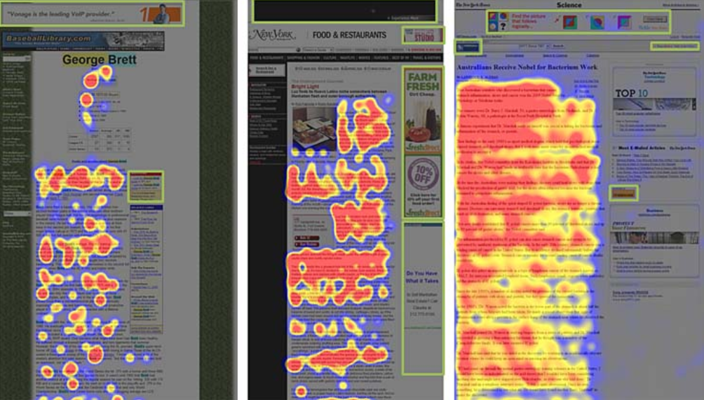
Escaping the banner blindness
Before we get into the tricky art of designing an ecommerce banner, it is important to understand the most important challenge they face. It relates to striking the balance of banner blindness vs the expectations of visual content.
The importance of banners in ecommerce
Did you know, that approximately 75% of users in ecommerce in the US search for visual content before carrying out a purchase on a regular basis? [1] Banners are used for example to direct the focus towards a certain sub-category. This sub-category can be not listed in the main navigation of the platform as a separate position, say it’s just a landing page containing the results of a search query for a certain keyword or an effect of filtering in the menu (for example – red lingerie in a lingerie store as a seasonal Valentine's Day offer).
As handy as they are, ecommerce banners are facing a considerable challenge – banner blindness.
What is banner blindness?
Even though banners serve a vital purpose in user experience, the growing tendency of online browsing is to ignore and eliminate for consciousness the elements that can potentially be of advertising characteristics. That’s what banner blindness is about – a usability phenomenon of consciously or unconsciously ignoring banner-like type of content and information.
Information overload
Banner blindness is a result of overdosing and over-saturating online space with stimulus and impulses. Should you consume all the content, web browsing would be a terribly exhausting experience. Hence, it naturally evolved to subconsciously learning how to focus on only the elements that are perceived to be useful, just like navigation, the menu, search bars or the titles.

Research confirms that most of the users of the web already possess the ability to visually avoid any content that in their perception can be related to advertising. Just think about it yourself next time you browse an online store – do you pay attention to what’s going on with the visuals? Exactly.
But the momentum goes even further – out of habit users started to ignore elements that are not adverts, but only share a resemblance with stereotypical ads. That’s why pop-ups, banners or anything that’s graphical and is located where usually ads are placed also get skipped, often unintentionally.
Blocking ads on the rise
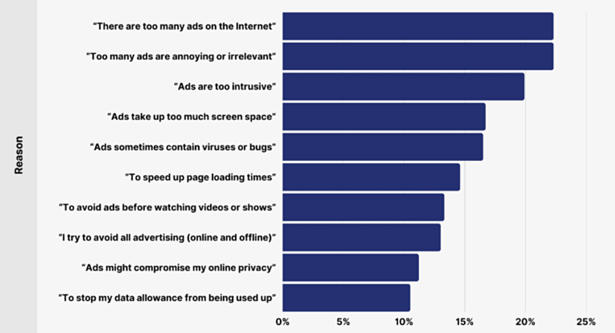
On top of that, tools that eliminate ads and block irrelevant commercial content only continue to gain ground. In 2020, it was reported that as much as 20% of all online sessions worldwide were blocked by an ad blocker installed in the browser [2].
Here are most popular reasons for using adblockers:
Understanding the presence and the impact of this phenomenon is crucial to properly design ecommerce banners. The desired result is to make users pay attention to the banner and to actually deliver a message whilst staying on top of the risks related to natural blindness.
How to design ecommerce banners
Aware of the risks and challenges, let’s dig deeper into the subject of ecommerce banners and take a closer look at the design.
Ecommerce banners – best practices
Just like billboards or printed advertisements, internet banners serve the same purpose and need to convey a certain message to the user without overloading their capacity to consume the content. With this in mind, it is good to follow the good old rules of designing ecommerce banners:
- Clear title – it should simply indicate what the banner is about.
- Simple design - focusing on just one element of the banner, without overcomplicating it.
- Understandable The Call to Action (CTA) - don’t forget that following the CTA is the main goal of the ecommerce banner.
- Easily digestible messaging – user must immediately understand what you want to say.
- Concise content – it mustn't take more than 3 seconds to convey the message.
- Well-designed animations - it should be well thought-through and in line with the design of the portal and in correlation with the tone of voice of the brand.
- Prioritization - each element of the banner should reflect the priorities. For example, your logo should be smaller compared to the discount info and in relation to the explanation of the rules of the promotion, etc.
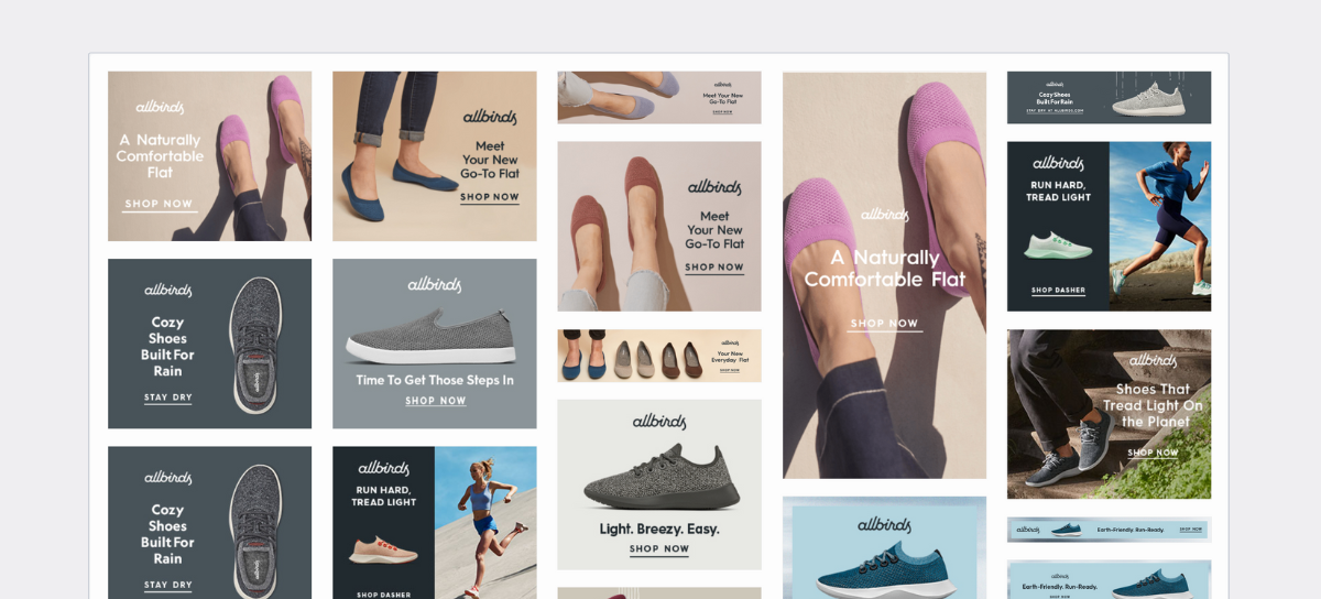
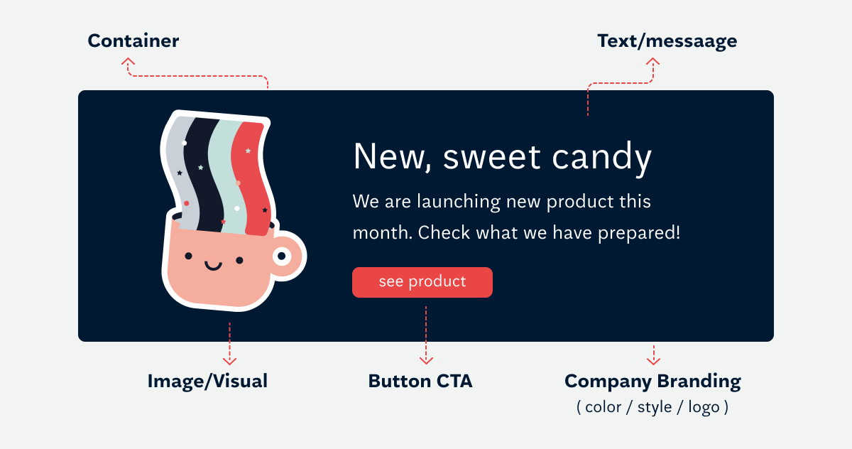
The anatomy of a typical ecommerce banner
Let’s take a look at a typical ecommerce banner and its contents:
The importance of a CTA
Your banner is only as good as the effectiveness of your CTA. It is important to understand that the call to action should be relevant to the action that you suggest the user should take.
When designing a CTA, consider every detail. For example:
- The copy - the wording should be applicable to the context of where the banner will be placed. Make it action oriented.
- The shape - the CTA button should be a button – plain text is not enough.
- The colour – don't be afraid to experiment and play around with colours.
- The messaging – go for a first-person speech.
- The action – aim for a sense of urgency and play on loss-aversion of the users.
Examples of locations of ecommerce banners
Firstly, we need to understand there’s different types of banners. Each type performs best in a different scenery and context. The most common division of banners is:
- Interactive banners – their goal is to convince the user to perform a quick, painless action. Examples can be related to taking part in a game or a competition, familiarising with a new offering etc
- Informative banners – their goal is to announce and communicate things. These can be related to informing the users about additional capabilities of the product or letting the users know about the status of certain aspects.
When it comes to ecommerce banner placement, there’s usually two options [3]:
- Above the fold (ATF) - ATF is the top of your website, where the user lands and what they see when they open the webpage, before scrolling it down. ATF placements enjoy higher viewability. Nonetheless, ATF is tricky to do right, since it's tempting to go too far with the design and saturate this space with ads and content. As a result, it’s easy to lower the SEO results and increase the bounce rate, since the users immediately get frustrated and don’t give the site a second chance.
- Below the fold (BTF) - this refers to the part of the site or the platform that users need to scroll to see. There’re more alternatives for placing banners BTF than ATF – here the banners can be on the side, in the middle of the content or underneath it. It is important not to interrupt the users with finding what they were looking for, as it usually backfires.
Ecommerce banners personalization
Across different marketing and advertising activities, personalization is a long-known tactic that is often a recipe for success. Custom, tailor-made content, messaging and design are what always resonates best with the individual preferences of the users. The recipient of a personalized message or design usually recognizes and appreciates the effort, which directly positively impacts conversion rates. According to research and studies, as much as 80% of consumers are more likely to make a purchase when approached with a personalized experience. [4] Read more about personalisation in our article: How to personalise your website for different users
In the ecommerce context, personalization focuses on displaying dynamic content based on collected and analyzed customer data, such as demographics, browsing history, past transactions, used devices etc. Big brands such as Amazon utilize their resources to go even further, introducing automated hyper personalization at scale. The leader in this field, according to 20222 Gartner’s “Magic Quadrant for Personalization Engines” [5] is Dynamic Yield.
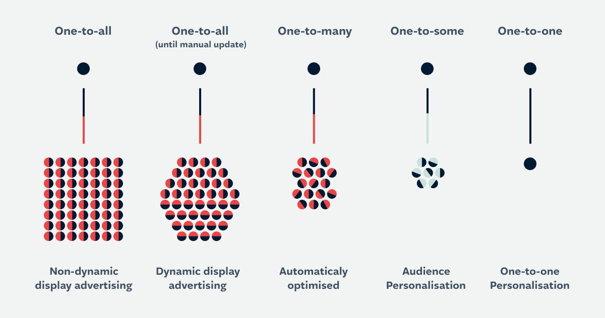
The most popular types of personalization are:
- Audience personalization (one to many) - In this scenario we aim to display ads tailored to specific groups of audiences using available data, like demographic. But we can also be more creative here. In one of our projects, we segmented users by interests and personality type: Visit Norway case study: Inspiring travel content in 14 languages
- One-to-one personalization (one to one) - Here you boil it down to the granularity of a person, displaying them advertisements specific to individual viewers, using first person data.
In order to display one-to-one personalized content on ecommerce banners, you need a tool that would facilitate collecting and segmenting user data – a Customer Data Platform (CDP). It is a type of software that integrates data from multiple sources and creates a centralized customer database. This database combines all the touchpoints and interactions of the user with your product, service or the brand. As a result, you can browse, filter and segment the database to create a unique, personalized experience in an automated manner. A good example of CDPs is Salesforce or Salesmanago.
The benefits of great ecommerce banner design
There’s plenty of benefits that come with investing time and effort in designing great ecommerce banners:
- Building trust of the user
- Creating a professional brand image
- Increasing conversions
- Making your messaging visually appealing
- Unifying your brand’s visual identity
- Delivering a positive first impression
- Directing the users to a desired offering
- Refreshing the brand by changing the banners seasonally
- Presenting real-life use cases of the products you sell
- Setting your brand apart against competition in the same segment
Wrapping things up
Defeating the natural need to block ad-like content is a tough nut to crack. But when done right, ecommerce banners can escape the maze of ignorance and inspire the user to act just as you prefer. Designing great ecommerce banners is all about striking the balance between attracting attention and delivering a seamless user experience. Hopefully now you know how to approach this challenge!
Footnotes
- (1) https://www.oberlo.in/blog/ecommerce-trends
- (2) https://earthweb.com/how-many-people-use-ad-blockers/#:~:text=In%20the%20final%20quarter%20of,blocked%20via%20an%20ad%20blocker.
- (3) https://setupad.com/blog/best-place-for-ads/
- (4) https://www.epsilon.com/us/about-us/pressroom/new-epsilon-research-indicates-80-of-consumers-are-more-likely-to-make-a-purchase-when-brands-offer-personalized-experiences
- (5) Published 18 July 2022 By Jason McNellis, Ant Duffin, Joseph Enever - https://www.gartner.com/en/research/magic-quadran

Book expert consultation!
If you want to use picking the brains of an e-commerce banner design expert, shout out!
Authors

Małgorzata Radkiewicz
e-Commerce Strategist
Małgorzata’s 15 years of experience have seen her delivering effective solutions to ecommerce brands of all shapes and sizes across the EU and UK. Małgorzata is experienced in brand positioning, traffic and ecommerce sales analytics and leading ecommerce teams and projects for B2B and D2C businesses.
 LinkedIn
Mateusz Różalski
Senior UX Designer
Mateusz is a designer with many years of experience and a background in music. He feels most identified with the role of a product designer. Not only is he great at UX and UI design, but he also excels in business analysis and communication with developers.
Related articles
![A well-crafted prompt doesn’t just work once. It works across teams, channels, and campaigns. It can be tweaked for new use cases and refined based on what performs best.]()
June 27, 2025 / 4 min read
Prompts are marketing assets: how to reuse, and scale them
Prompts aren’t throwaway lines. They’re repeatable, scalable assets that can streamline your marketing your team’s output. Learn how to build a prompt library that delivers.
![Woman using a wheelchair in the office settings]()
June 17, 2025 / 5 min read
What is accessibility and why it matters?
Accessibility ensures everyone — including those with disabilities or limitations — can read, navigate, and engage with your content equally.

